| Author | Thread |
|
|
07/17/2006 09:21:49 PM |
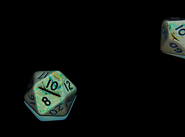
I prefer the original. But then, I think I prefer bright images to darker ones.
I would also like to see both dice in frame.
But my main concern is the lack of context. I agree with Raish's many questions - what do these dice convey?
If there's no meaning to having rolled two of them, then I think I would've preferred a square crop around one. Make that the sole subject. |
|
 Photographer found comment helpful. Photographer found comment helpful. |
|
|
07/17/2006 04:10:23 PM |
Here's the original...

I figured with the weird lighting, the invert would be better - do you (jhonan and/or others) like the original more? |
|
|
|
07/17/2006 03:39:12 PM |
Ah, now I see what makes this image look odd to me. It's the 'invert'!
I had noticed that shadow under the main dice, and that strange green hue, which was a bit distracting. I'm not sure that inverting really added anything to this, in fact it created a couple of distractions. |
|
| Photographer found comment helpful. |
|
|
07/17/2006 02:20:55 PM |
I think it was a hard challenge. Maybe the difficulty is highlighted in a picture like this one. I doubt that I would have left a comment, because my main reaction is a sort of 'so what'.
The number ten is visible on each of the dice. I'm not familiar with dice like that, but it says 'Dice Roll' for the title so they must be dice. Whether or not the thrower of these dice should be happy or sad I couldn't say.
The dice are isolated against the black and the lighting isn't blowing them out, so the shot is technically sound. Is that a shadow under the dice that's become silver-grey after inverting a selected background? For all I know it could be a little metal thing on which the dice sit due to the nature of the game.
Please don't feel you have to return the comment - I don't know much about this stuff so I'm practising and you've given me an opportunity. By all means give me feedback on my comments, I'd appreciate it.
The revealing detail of imperfection on the dice demonstrates (to me) that you have control of the medium. So there are no mistakes here. I think the problem is in the subject/theme and me not getting it.
Good thing there's another challenge to come, eh? |
|
| Photographer found comment helpful. |
|
|
07/17/2006 05:10:53 AM |
| I gave it a 6 because I thought the idea was good and the clarity was nice. I would have gone higher if both dice were completly in frame. With images like this I tend to subscribe to the rule of all of it or none of it. |
|
| Photographer found comment helpful. |
|
|
07/17/2006 01:37:12 AM |
The reflection or shadow looks odd and I agree about the other die being distracting or not belonging. I must not be familiar with these dice as nobody has mentioned the writing/scrawling on it.
Overall an unappealing image - but 3 people gave it a 10 so what do I know. ;-) |
|
| Photographer found comment helpful. |
|
|
07/16/2006 08:23:14 PM |
its an almost pretty di-twenty, and the matching percent half off the page. I didn't vote in this challenge, but, I don't think I would have scored this very high.
I don't care for the (negative looking) shadow under the dice. The colours don't 'pop' enough for me, don't care for the half off the page effect.
maybe if you had 10d10 all on ten, and title it Max Damage or Breath Weapon or something???? Something to make it more exciting.
But what do I know? mine barely did better than yours, and I thought mine was clever... 6-;
Thanx though.. I miss my dice collection now )-; L()L |
|
| Photographer found comment helpful. |
|
|
07/16/2006 08:18:27 PM |
| I find the second dice distracting from the main dice. I was also puzzled by the shadow on the main dice. |
|
| Photographer found comment helpful. |
Home -
Challenges -
Community -
League -
Photos -
Cameras -
Lenses -
Learn -
Help -
Terms of Use -
Privacy -
Top ^
DPChallenge, and website content and design, Copyright © 2001-2025 Challenging Technologies, LLC.
All digital photo copyrights belong to the photographers and may not be used without permission.
Current Server Time: 04/07/2025 01:09:17 PM EDT.