| Author | Thread |
Comments Made During the Challenge  |
|
|
07/03/2006 03:59:18 PM |
Meets Challenge: 1/1
Lighting: 1/2
Focus: 0/2
Creativity: 0/2
Aesthetics: 0/3
Explanation: When I rate an image that is below 3, I will offer an explanation.
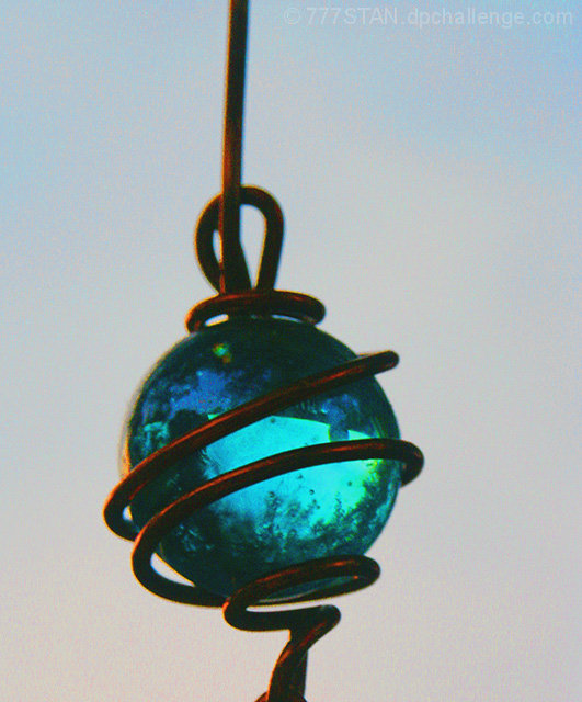
Lighting: The lighting is okay in concept. However, the image looks as though it was too dark in the original, so the exposure was cranked up in photoshop, resulting in muggy colours.
Focus: The entire image is a little blurred. A faster shutterspeed and some more light would help.
Creativity: It's just a bead, slightly off center and is overall unintersting. A photo like this can be quite nice if it meets all technical aspects perfectly. Perfect lighting, focus and framing can definately take a simple object and make it interesting.
Aesthetics: All of the above points, mostly the graininess, muggy colours, high saturation to the point of colour bleeding etc. make the image unappealing. Many product photos are faced with taking a simple object, and making it stunning. Photography can do this. It looks as if this was a crop of a large image not focused on this item in particular. If that's the case, try a lower iso (50 or 100). Also, external lighting can be helpful in closeups even at moody natural scenes with a sunset. Put a gel over a studio light, or even a lamp, that matches the main colour of the natural light. Bounce the light off of a white card and you can get some more light in your image without washing out the colours. |
|
 Photographer found comment helpful. Photographer found comment helpful. |
|
|
07/03/2006 06:40:20 AM |
| Some more sharpness of the subject would make this a better shot for me. |
|
| Photographer found comment helpful. |
|
|
07/02/2006 01:13:31 PM |
| The image is a little fuzzy around some of the edges. |
|
| Photographer found comment helpful. |
|
|
07/01/2006 06:56:36 PM |
| The nice soft background tones blend well with the red of the holder and the turquoise of the glass. It could probably stand a touch of NeatImage, but I don't mind the color noise myself - I kinda like it in this shot. |
|
| Photographer found comment helpful. |
|
|
06/30/2006 05:07:50 AM |
| not sharp enough, but well lit a 5 |
|
| Photographer found comment helpful. |
|
|
06/29/2006 02:24:33 PM |
|
| Photographer found comment helpful. |
|
|
06/29/2006 06:54:16 AM |
|
| Photographer found comment helpful. |
|
|
06/29/2006 06:37:21 AM |
| seems cloudy. if it were clearer it would be better. |
|
| Photographer found comment helpful. |
|
|
06/29/2006 06:36:17 AM |
| Neat idea and the sun reflecting off the metal part adds to it. In my opinion, removing the noise and sharpening (if possible without adding much noise) would improve it. |
|
| Photographer found comment helpful. |
|
|
06/28/2006 10:07:18 PM |
| great idea, wished it wasn't so grainy |
|
| Photographer found comment helpful. |
|
|
06/28/2006 12:20:20 PM |
| A lot of noise, for a good image of glass. |
|
| Photographer found comment helpful. |
|
|
06/28/2006 11:24:11 AM |
| There's an annoying amount of saturation in the background and what appears to be CA on the wire (it's red on the left and blue on the right). |
|
| Photographer found comment helpful. |
Home -
Challenges -
Community -
League -
Photos -
Cameras -
Lenses -
Learn -
Help -
Terms of Use -
Privacy -
Top ^
DPChallenge, and website content and design, Copyright © 2001-2025 Challenging Technologies, LLC.
All digital photo copyrights belong to the photographers and may not be used without permission.
Current Server Time: 04/07/2025 01:38:09 PM EDT.