| Author | Thread |
Comments Made During the Challenge  |
|
|
07/04/2006 07:19:30 AM |
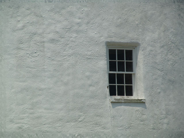
| I like the simplicity of this shot. Texture of the wall adds interest. Focus and DOF could be slightly better. |
|
|
|
07/04/2006 07:02:56 AM |
| Nicely simplified and love the composition, just think I would have liked it heaps more if the contrast were boosted up, seems a bit flat as it is now. |
|
|
|
07/02/2006 10:06:57 PM |
| very simplystic, but I miss a spark. |
|
|
|
07/01/2006 05:55:27 PM |
| While like this style of composition, I don't know that this strongly says "glass" per the challenge topic. Nice exposure to bring out the texture of the wall. |
|
|
|
07/01/2006 06:10:16 AM |
| A little more cropping and a border would have helped frame the window a some more. :) |
|
|
|
06/30/2006 11:10:13 AM |
| the composition in this is o.k . The window does not to seem to be in sharp focus though. 5 |
|
|
|
06/30/2006 05:04:28 AM |
| Nice use of the rule of thirds |
|
|
|
06/29/2006 01:09:00 PM |
| Nobody will agree with me but i like it. ta heck with the rest of ya |
|
|
|
06/29/2006 08:52:59 AM |
| Great light and time of day. |
|
|
|
06/28/2006 08:54:39 AM |
| ok, but there's nothing that grabs my interest. |
|
|
|
06/28/2006 05:19:57 AM |
| Nice use of negative space. |
|
Home -
Challenges -
Community -
League -
Photos -
Cameras -
Lenses -
Learn -
Help -
Terms of Use -
Privacy -
Top ^
DPChallenge, and website content and design, Copyright © 2001-2025 Challenging Technologies, LLC.
All digital photo copyrights belong to the photographers and may not be used without permission.
Current Server Time: 04/07/2025 01:25:48 PM EDT.