| Author | Thread |
|
|
07/02/2006 10:54:25 PM |
hello again,
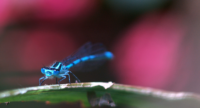
i think the problem was that tiny dof almost evaporates into the rest of the pic and you almost miss that the face IS in focus. maybe ifn you could have had him bigger, he would have had a great face only focus.
i like the pic though, and the title. i think well done despite what others think. lol. |
|
 Photographer found comment helpful. Photographer found comment helpful. |
|
|
07/02/2006 06:53:54 AM |
I have a problem with this picture in that so much of it is out of focus. Now I realize that is the point of the challenge, but I would like to have more or even all of the insect in focus. As it is, I find my eye drawn to the bright bokeh rather than to the insect. Also, I keep looking at the little purple thingy down front. My eye should not be drawn there either.
Having said that, I like the colors a lot...and the very soft feel of the bokeh.
I didn't vote in this challenge because of my trip. I probably would have given it a 5, possibly a 6. |
|
| Photographer found comment helpful. |
|
|
06/30/2006 12:12:25 AM |
| Trading Post - Way to go on setting up the shot to bring in more color and have more attention brought to the background bokeh. Great thinking. I did not vote in this challenge but probably would have gone a 6. I would have scored it much higher had more of the bug been in focus. Great combination of colors though a slight sat adjustment on the green to bring it out a bit more would hav ebeen nice. |
|
| Photographer found comment helpful. |
|
|
06/29/2006 10:13:39 PM |
Trading Post comment
Tres cool shot! Definitely meets the challenge. I like the detail you can see in the little guys "face" and the bokeh very much works here - clever idea to "create" that bokeh, too. To make it better? Maybe a bit sharper on the damselfly, but working with that close a macro, I'm not entirely sure how you'd do that. I've yet to even try anything that close, but I'm pretty sure it ain't easy. Well done, and underrated.
OK, just peeked - I see you got a comment from the good Doc. :-) |
|
| Photographer found comment helpful. |
|
|
06/28/2006 04:56:09 PM |
I gave this picture a 7 which is quite good in my book. I really did appreciate the way the canvas was separated into different colors. Composition, therefore, is quite nice. Two nitpicks. One, I don't like the highlight on the branch in the middle of the picture. It competes too much for our eye's attention. Second, I would have liked to see more of the bug in focus. The DOF here is razor thin and had you been able to keep more of the little guy in focus while maintaining a blurry background, I think this shot could have soared.
I guess if I gave you a 7, I'd consider your final score to have sold you quite a bit short. |
|
| Photographer found comment helpful. |
|
|
06/28/2006 10:06:22 AM |
Trading post...
As I commented in voting, I'll just go a little further. What would have made this a 10 is if you had gotten the damselfly just a bit sharper. Other than that it is an excellent shot! |
|
| Photographer found comment helpful. |
Comments Made During the Challenge  |
|
|
06/24/2006 11:19:35 PM |
| Nice colours. A little more depth of field would be nice on this one. Just enough so that the whole tail were sharp. I think that would add interest, plus the angle of the tail would help draw the eye through the photo. |
|
| Photographer found comment helpful. |
|
|
06/24/2006 09:15:10 PM |
|
| Photographer found comment helpful. |
|
|
06/24/2006 04:55:51 AM |
| Great background colours. |
|
| Photographer found comment helpful. |
|
|
06/22/2006 08:03:34 PM |
|
| Photographer found comment helpful. |
|
|
06/22/2006 03:40:37 PM |
| cool shot - what did you feed this guy? looks like uranium! I love dragonflys! |
|
| Photographer found comment helpful. |
|
|
06/22/2006 09:28:47 AM |
| I already voted, now back for comments. I gave you a 9 on this shot. Lovely colors, crisp detail, interesting subject and bokeh. |
|
| Photographer found comment helpful. |
|
|
06/21/2006 01:00:13 AM |
| Laugh - the title's dead on target. :) |
|
| Photographer found comment helpful. |
Home -
Challenges -
Community -
League -
Photos -
Cameras -
Lenses -
Learn -
Help -
Terms of Use -
Privacy -
Top ^
DPChallenge, and website content and design, Copyright © 2001-2026 Challenging Technologies, LLC.
All digital photo copyrights belong to the photographers and may not be used without permission.
Current Server Time: 02/01/2026 12:06:16 PM EST.