| Author | Thread |
|
|
07/09/2006 02:40:10 PM |
sorry for lateness
I'm not sure what I think about this one. I think that if I can across it in the challenge I wouldn't have voted it terribly well, but looking at it now I'm beginning to like it a lot more.
The high contrast does play a role I believe, even if it put me off to start with - not sure how to describe it but it does gice a kind of lost, desolate, not-sure-whats-going-on-with-your-life feel to it, which I think is what you were aiming for
I still think the processing went a bit too far though, but it certainly made me think |
|
 Photographer found comment helpful. Photographer found comment helpful. |
|
|
07/02/2006 07:05:20 PM |
hello again,
i was unable to enjoy the processing of this one. the concept seemed good enough which kept you from getting a lower score from me... but i did not like the processing at all. i could not understand the point of it, how it pertained to this particular shot. |
|
| Photographer found comment helpful. |
|
|
07/02/2006 04:18:10 AM |
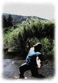
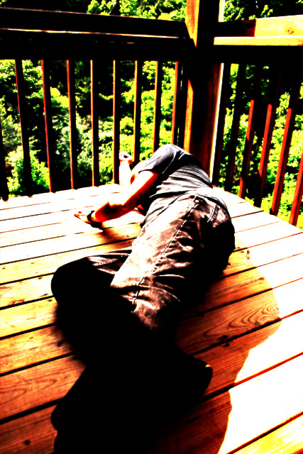
Trading Post
This one is too processed for my taste especially the leaves in the background. I am not sure I get the point of the shot...looks like he is just hanging out on the deck, so I am afraid I don't see the "desolation". The black area lacks definition so I can't tell what it is. The culmination of all of this is that I really can't quite figure this one out, I am sorry to say. I didn't vote in this challenge, because I was out of town. It's probably just as well as I wouldn't have helped your score any given my inability to figure it out and the extent of the PP. lol. |
|
| Photographer found comment helpful. |
|
|
06/29/2006 08:27:55 PM |
| Trading Post - I must say that I didnt get this one during challenge and I still struggle a bit now. I could tell that you were shooting for something but wasnt quite sure what. The processing was over the top and made it a bit hard to look at. So what is the purpose of the black? |
|
| Photographer found comment helpful. |
|
|
06/27/2006 02:05:48 PM |
Trading post...
I gave you a 5 in voting on this. It seems to suffer from over processing. I think if you had taken this a little later in the day, more towards twilight it would have gone over better. Don't get me wrong, I'm not against the overprocessing (as you've seen and will see again with my glass challenge), hence the 5, but sometimes it just doesn't seem to fit with the voters. |
|
| Photographer found comment helpful. |
|
|
06/26/2006 04:46:22 PM |
Trading Post comment
First, I've gotta say I love reading your comments on your photographs. I commented on this during the challenge - like the idea and the composition but am not thrilled with the processing. That said, without the processing I suspect it wouldn't have been as interesting a picture, because it is interesting - makes you stop and look. I think you came pretty close to achieving what you set out to do, and that's a good thing! |
|
| Photographer found comment helpful. |
Comments Made During the Challenge  |
|
|
06/25/2006 10:47:06 AM |
| the prosessing, while intreging, is a little much for me. |
|
| Photographer found comment helpful. |
|
|
06/24/2006 01:45:14 PM |
| Composition overall is interesting but I don't particularly like the post processing. |
|
| Photographer found comment helpful. |
|
|
06/23/2006 02:25:25 AM |
| Good idea but I am not sure about the processing. |
|
| Photographer found comment helpful. |
|
|
06/22/2006 10:04:14 PM |
| Colors just a little too saturated to fit with the image. |
|
| Photographer found comment helpful. |
|
|
06/22/2006 07:47:08 PM |
While it is possible that the image could be interpreted as conveying a sense of "Desolation"... it could also be representative of the results of a Friday Night "Binge".
The harshness of the lighting would seem to suggest that the image was taken at High Noon, and the dark shadows at the bottom portion of the image effectively obliterate any definition that may have existed.
Keep shooting... practice it is said ... makes perfect. |
|
| Photographer found comment helpful. |
|
|
06/20/2006 04:47:05 AM |
| I think it's overprocessed |
|
| Photographer found comment helpful. |
|
|
06/19/2006 10:51:35 PM |
| seems to be overprocessed to the point of losing detail |
|
| Photographer found comment helpful. |
|
|
06/19/2006 09:19:50 PM |
| Washed out highlights and oversaturated. |
|
| Photographer found comment helpful. |
|
|
06/19/2006 08:22:24 PM |
|
| Photographer found comment helpful. |
|
|
06/19/2006 05:36:50 PM |
| Umm not to fond of the high contrast on this maybe it would of worked a lil better in B&W? |
|
| Photographer found comment helpful. |
|
|
06/19/2006 12:05:18 PM |
| I can't decide if I like the grunge or not... but it's certainly noticable, which is why I'm mentioning it :-) The black shadow is a little distracting for me, but I think it's a great pose and camera angle. The bars might even give a feeling of imprisonment if the tops of the railing were not in the scene. |
|
| Photographer found comment helpful. |
Home -
Challenges -
Community -
League -
Photos -
Cameras -
Lenses -
Learn -
Help -
Terms of Use -
Privacy -
Top ^
DPChallenge, and website content and design, Copyright © 2001-2025 Challenging Technologies, LLC.
All digital photo copyrights belong to the photographers and may not be used without permission.
Current Server Time: 04/07/2025 01:50:44 AM EDT.