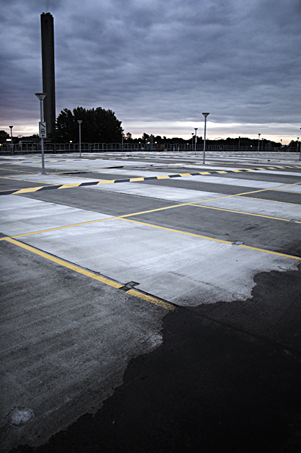
Shot on top of a brand new parking building near the hospital where I work. Flipped image horizontally, burned and dodged some sky, removed vignetting, straightened horizon, cropped, levels, hue/sat, resized, USM, saved for web.
Statistics
Place: 129 out of 197 Avg (all users): 5.3207 Avg (commenters): 6.5000 Avg (participants): 5.3291 Avg (non-participants): 5.3143 Views since voting: 851 Views during voting: 259 Votes: 184 Comments: 6 Favorites: 0
Greetings from the Critique Club!
Very nice photograph! very very creative and very well thought out.
You did well!
a few things i see as an artist, and, remember, we all see things thru different eyes, so this is not to be taken to heart, just suggestions you may or may not agree with, that is ok!
First, i find there is to much empty space in between the black on the bottom right, to the darkness at upper part, it does not give me the feeling it is taking over, instead i feel the lighter color is taking over, but still well thought out.
I wonder, had you stood back further and left more of the darker pavement in the picture, and a bit different angle, if you would lead me to feel the blackness is taking over.I also wonder if you left out the tall skyscraper and just left the dark trees on the other side, what that would do and leave less sky? just thingsthat are popping out at me that i see, that may be a bit different than you.
Still i commend you on this! Congrats on a photo well thought out and executed.
Christine
Aka sarnewfie.
this shot really points out the problem with these challenges..there is no way it doesn't effectively convey desolation as well as a misty ocean, and yet look at the score difference...well thought out, and well done!