| Author | Thread |
|
|
10/12/2006 08:04:51 PM |
| I like this a lot, the color and composition are excellent. |
|
 Photographer found comment helpful. Photographer found comment helpful. |
|
|
06/15/2006 07:59:56 PM |
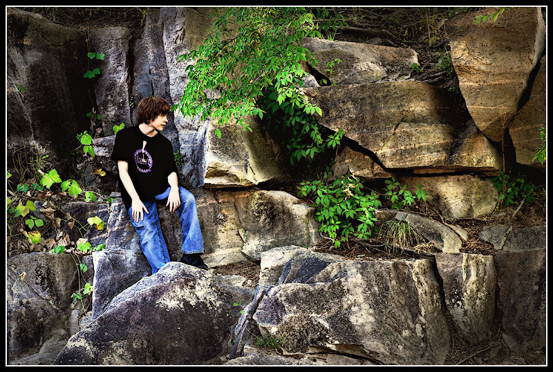
Fantastic colors!. I really like the composition here. I dont think a tighter crop is really needed at all. This shows me not only your son, but the scenery he is taking in around himself.
I agree with the others that the shirt logo makes him look twisted a bit. Also, his arms are so pale in comparison to the shirt they almosy look like they were cut/pasted on. |
|
| Photographer found comment helpful. |
|
|
06/15/2006 07:44:58 PM |
| I noticed that the way the shirt logo is, it almost looks like he is tilted a bit funny. But that's *after* I got over the fact that WOW is this a beautiful shot. |
|
| Photographer found comment helpful. |
|
|
06/15/2006 07:43:30 PM |
| The colors are awesome! Is there a way to better define his shirt I wonder? It makes him look slightly distorted but it could just be my monitor. |
|
| Photographer found comment helpful. |
|
|
06/15/2006 07:41:24 PM |
Colours are great and the exposure and composition works for me.
However, a little separation between your son's head and the tree is needed. As it is it looks like the tree is growing out of his head. ;o) |
|
| Photographer found comment helpful. |
|
|
06/15/2006 07:39:18 PM |
| Fantastic colors, Scott. Closer frame or tighter crop might be better to see your son. Well done. |
|
| Photographer found comment helpful. |
Home -
Challenges -
Community -
League -
Photos -
Cameras -
Lenses -
Learn -
Help -
Terms of Use -
Privacy -
Top ^
DPChallenge, and website content and design, Copyright © 2001-2025 Challenging Technologies, LLC.
All digital photo copyrights belong to the photographers and may not be used without permission.
Current Server Time: 04/07/2025 09:28:15 PM EDT.