| Author | Thread |
Comments Made During the Challenge  |
|
|
06/18/2006 07:19:30 AM |
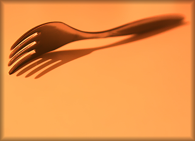
| Hope the crowd likes this composition. Love the colour and that fram is the icing on the wonderful cake, fork it out. |
|
 Photographer found comment helpful. Photographer found comment helpful. |
|
|
06/17/2006 02:45:58 PM |
| Sometimes simplicity is good. This is a good photo. I might have increased the DOF so the whole fork would be in focus. |
|
| Photographer found comment helpful. |
|
|
06/16/2006 04:49:31 AM |
| composition is a little unusual in this one, as is the choice of tones... not sure such warm orange / peach colours really works on something tha would normally be cold to touch. the shallow depth of field adds interest, though i would have preferred the blurriness to start just behing the curve spine bit in the fork. i don't normally refer the border, but here it's so prominent (and distracting) i thought i should; something simpler, in a more complementary shade would probably work nicer. it does meet the challenge, but overall it just lacks a certain pazzazz. 6. |
|
| Photographer found comment helpful. |
|
|
06/15/2006 08:38:55 PM |
|
| Photographer found comment helpful. |
|
|
06/15/2006 02:13:21 PM |
|
| Photographer found comment helpful. |
|
|
06/15/2006 10:13:02 AM |
Challenge: SHADOWS III
Description: Creatively capture a shadow
Advanced Edit
Simplicity
Fit: Epitomises the idea behind the challenge 2
This is a great use of a shadow in a simple way
Aesthetics: Well composed, aesthetically pleasing 2
Technical: Technically well executed 2
Hints of some noise let this down a little
Wow: Slaps you in face 3
This one did it for me
Total Score = 9 |
|
| Photographer found comment helpful. |
|
|
06/15/2006 09:58:47 AM |
| like how it looks likethe fork fades into the paper |
|
| Photographer found comment helpful. |
|
|
06/15/2006 06:39:13 AM |
| Very good use of the DOF. |
|
| Photographer found comment helpful. |
|
|
06/14/2006 11:29:01 PM |
|
| Photographer found comment helpful. |
|
|
06/14/2006 09:24:24 PM |
|
|
|
06/14/2006 05:25:46 PM |
| i love the colors and the beveled border! |
|
| Photographer found comment helpful. |
|
|
06/14/2006 10:17:31 AM |
| Simplicity is always the best. I would have liked to see all of the fork in focus...the handle is a out of focus. |
|
| Photographer found comment helpful. |
|
|
06/13/2006 11:35:57 PM |
| It looks a little too post processed on the top right corner |
|
| Photographer found comment helpful. |
|
|
06/13/2006 10:07:43 PM |
| Some color adjustment might help this a little IMO. I think cooler colored image with more light areas would be more affective. |
|
| Photographer found comment helpful. |
|
|
06/13/2006 08:17:54 PM |
| Very nice, simple composition, uses shadow well. |
|
| Photographer found comment helpful. |
|
|
06/13/2006 03:21:27 PM |
| Simplicity is hard. In this case, I like the composition and the negative space. I don't care much for the orange tint and the lack of DOF. |
|
| Photographer found comment helpful. |
|
|
06/12/2006 12:02:13 PM |
| Nice, but I think I would have preferred it if both the tip and stem were in focus too. Or maybe the tip is unsharp because if the blurred border. It distracts a bit either way. |
|
| Photographer found comment helpful. |
|
|
06/12/2006 09:24:06 AM |
| Appears a little over processed |
|
| Photographer found comment helpful. |
Home -
Challenges -
Community -
League -
Photos -
Cameras -
Lenses -
Learn -
Help -
Terms of Use -
Privacy -
Top ^
DPChallenge, and website content and design, Copyright © 2001-2026 Challenging Technologies, LLC.
All digital photo copyrights belong to the photographers and may not be used without permission.
Current Server Time: 02/01/2026 08:53:46 AM EST.