| Author | Thread |
|
|
06/24/2006 03:18:53 AM |
Greetings from the Critique Club
First impression and overall look:
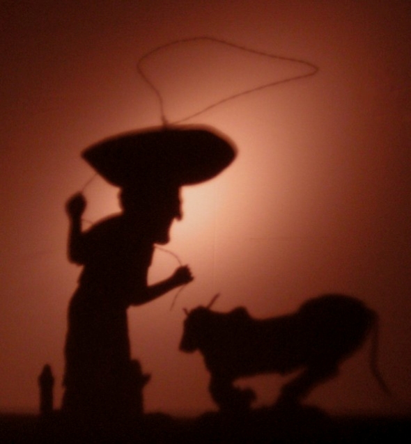
Nice idea, but not overly well executed. For starters, there's too much noise in this image. I'm certain that NeatImage would work miracles on this photo. You can dowload a trial version //www.neatimage.com.
Second, the shadow of the bull is distorted. It would work better if it was perpendicular to the wall, to keep it sharp at all sides. Right now his bum is very fuzzy.
The bright reflection of the light I do not mind. It makes it appear that there is a setting sun in the image, silhouetting the cowboy and his bull.
Technical and post processing:
As said earlier, you really need more noise reduction here. Noise can add to an image, but this is not one of them. I would also put a bit more contrast in, darkening the shadows some more.
I can really tell if the photo is slightly out of focus, or if the shadows are fuzzy because of the distance of the figures to the wall, but that is definitely something to improve.
Meeting the challenge:
yes it does really meet the challenge. I fear that the technical part of the photo did you in.
How to raise your score:
A crisper image usually does better on DPC. NeatImage and a sharper shadow would help loads. |
|
 Photographer found comment helpful. Photographer found comment helpful. |
|
|
06/21/2006 09:45:15 AM |
| You need a sharper (less diffused) light source to improve the edge sharpness of the shadows. As it is, it looks blurred. |
|
| Photographer found comment helpful. |
Comments Made During the Challenge  |
|
|
06/18/2006 07:52:39 PM |
| wonderfully creepy. tell me that you made this sculpture yourself and I'll mail you two additional points. Til then, settle for an 8. |
|
| Photographer found comment helpful. |
|
|
06/18/2006 06:18:26 AM |
| Heheh, this is both great and funny! Hope it does well, excellent composition! |
|
| Photographer found comment helpful. |
|
|
06/16/2006 05:57:48 AM |
| A good idea. Entertaining. But I think it could have been done better by using card cut-outs of, say, cactus in the foreground. With some depth in the photo, by using cut-out layers, you could draw the viewer into the drama and picture. |
|
| Photographer found comment helpful. |
|
|
06/15/2006 02:44:59 AM |
|
| Photographer found comment helpful. |
|
|
06/11/2006 11:30:05 PM |
| I don't like the light source, the shadow is a bit blurred? Thumbnail looks better than real picture! But the concept is good, composition and colors, but too bad about the blur. |
|
| Photographer found comment helpful. |
|
|
06/11/2006 09:25:12 PM |
| I really like this because it is creative and it really works with the Shadows theme. |
|
| Photographer found comment helpful. |
Home -
Challenges -
Community -
League -
Photos -
Cameras -
Lenses -
Learn -
Help -
Terms of Use -
Privacy -
Top ^
DPChallenge, and website content and design, Copyright © 2001-2025 Challenging Technologies, LLC.
All digital photo copyrights belong to the photographers and may not be used without permission.
Current Server Time: 04/07/2025 01:10:06 PM EDT.