| Author | Thread |
|
|
01/22/2007 01:30:36 PM |
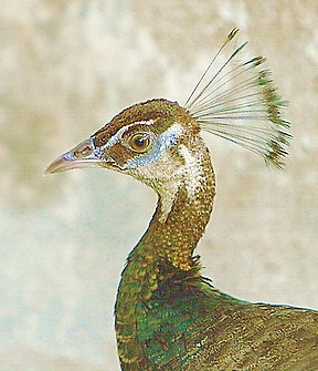
| I like the composition and the crop. Focus is very good. Might appeal to more people if the colors were a little less overexposed. Since you were using a flash, perhaps use a smaller aperture or use exposure compensation in the camera (love that feature on the XT) would help make the colors a bit more vibrant. Could also work a little magic post processing, but I like that you are trying to get the best straight from the camera. That's the very best way to learn. I really like this photo! For being in a hurry, you've done a great job. |
|
|
|
07/14/2006 05:05:56 PM |
Thank you for all of your comments
First of all, i don't like this pic because simply it is taken in hurry in very low light and i used my flash, but as you all seen, it is not good enough.
I forgot to say that i took this shot with my 70-200L IS lens (by mistake i mentioned 24-70L).
I wish to get better camera and better lens for birds like 100-400L or 500L but later i will buy more gears.
I am not good in photoshop, so if someone can help me in Edit processing then i will be glad to take alot of photos nd upload RAW original photos if that possible.
About the place i posted this photos i didn't know what "indulgent" means just i saw it is an exclusive challenge which is open for all users i posted it there, i don't have chance to take photos as challenge titles need but i want to post many photos here without enter challenge, just for critique but not in a thread i want it same as many photos here with information and comments down of the photos, of you know a way to post as many photos here free then it will be great as i am registered on another forum with better critique and free posting photos for all members and users, not making separate between members and non members. |
|
|
|
06/27/2006 06:29:37 AM |
Hey there from the Critique Club
Welcome to the challenges. I think that this should be a great learning entry for you. Rule number one around here is to use the full size parameters that DPC allows for each challenge. As you can see, the voters and comm enters will beat you down pretty hard for small images.
Camera Work/Technical: While I believe that your subject is crisply focused, it is hard to tell with the washed look that this one has. I am not sure if it was just a harsh exposure, or if it was done with post-processing.
Lighting: While the lighting looks nicely even, the entire image has an overexposed and washed out look to it.
Composition/Content: Cool composition. I like the way the shape of the bird's neck pulls the eye up and into the image, then the beak and feathers take over to give this one a very nice balance.
My Opinion: With an image this size, you did pretty well with the score you got. I have seen similar sizes do much worse. Make sure your submission are as large as allowed and your score will grow greatly.
Eric
|
|
Comments Made During the Challenge  |
|
|
06/20/2006 07:48:09 PM |
| I have a number of issues with this photo. Firstly, it seems over exposed. With less light the rich color of the feathers would have shown better. The background doesn't detract from the bird but it doesn't contribute to the photo either. And finally the photo is too small. If you were to reshoot to correct these things, I think it would score in the 5-6 range. Lastly, it doesn't really call out to me saying "Indulgent." Maybe there's a cultural thing going on so it could be my issue. |
|
|
|
06/20/2006 04:09:57 PM |
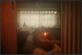
| would be better, if the photo included the house he was in. Maybe on the stairs or something... |
|
|
|
06/19/2006 01:17:42 PM |
| Too small and wierd exposure or color balance problem. Neat idea but lacks the technicals to really work. Sorry. :( |
|
|
|
06/15/2006 10:57:07 PM |
| Not sure what this ha to do with the subject of indulgence?? |
|
|
|
06/15/2006 05:18:37 PM |
| looks too small and the colors seem washed out. |
|
|
|
06/15/2006 05:12:59 PM |
|
|
|
06/15/2006 04:07:16 PM |
|
|
|
06/15/2006 10:59:00 AM |
| I like the composition and colors. Very appealing. |
|
|
|
06/15/2006 08:35:35 AM |
|
|
|
06/14/2006 03:55:51 PM |
| looks like you tried to make a painting or something. Not sure I like that - image seems a little flat. focus is good. |
|
|
|
06/14/2006 11:17:27 AM |
| Sorry, I don't see the challenge topic here. |
|
Home -
Challenges -
Community -
League -
Photos -
Cameras -
Lenses -
Learn -
Help -
Terms of Use -
Privacy -
Top ^
DPChallenge, and website content and design, Copyright © 2001-2026 Challenging Technologies, LLC.
All digital photo copyrights belong to the photographers and may not be used without permission.
Current Server Time: 02/01/2026 09:46:13 AM EST.