| Author | Thread |
|
|
08/19/2006 08:50:05 AM |
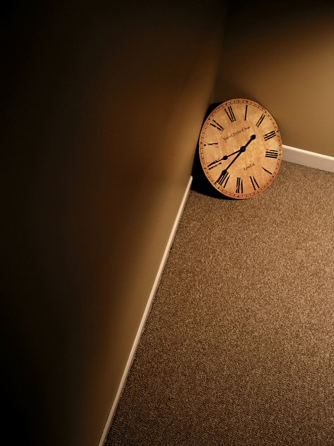
| This has worked really well, nice lighting, the colours of the room go well with the clock and I like the detail you have captured :o) |
|
 Photographer found comment helpful. Photographer found comment helpful. |
Comments Made During the Challenge  |
|
|
06/11/2006 07:29:39 PM |
| Great take on the challenge theme and concept. Top5 fave. |
|
| Photographer found comment helpful. |
|
|
06/11/2006 06:47:06 PM |
| Nice light, angles, color tones ... |
|
| Photographer found comment helpful. |
|
|
06/11/2006 03:56:19 PM |
The high camera angle makes this look kinda awkward. Great tonality.
TC |
|
| Photographer found comment helpful. |
|
|
06/11/2006 12:33:26 PM |
| very interesting...i live this shot! |
|
| Photographer found comment helpful. |
|
|
06/09/2006 08:03:05 PM |
| Nice concept, well executed. This is one I hope people don't judge on the thumbnail. Angles, lighting are nicely done for this picture. |
|
| Photographer found comment helpful. |
|
|
06/09/2006 08:14:00 AM |
| Clean lines. Creative setup. From the thumbnail I thought the clock was put in the top corner of the room. This was easier. ;^) |
|
| Photographer found comment helpful. |
|
|
06/09/2006 05:31:28 AM |
| Looks a little tight but it's a nice object, I love the lighting. |
|
| Photographer found comment helpful. |
|
|
06/09/2006 04:04:39 AM |
|
| Photographer found comment helpful. |
|
|
06/08/2006 08:26:15 PM |
Nicely conceived. I never quite thought of it in those terms.
I really enjoyed this one. |
|
| Photographer found comment helpful. |
|
|
06/08/2006 04:11:27 PM |
|
| Photographer found comment helpful. |
|
|
06/08/2006 03:16:27 AM |
| I like the title and the concept. I think you could have emphasised the space. This image is a bit to 'tight' IMHO. |
|
| Photographer found comment helpful. |
|
|
06/07/2006 12:16:03 PM |
| I like the subject, love the colors, but I would like the see the lines moving in a better direction, either horizontal, vertical, or 45 degree. Overall, though, this is really neat. |
|
| Photographer found comment helpful. |
|
|
06/06/2006 04:53:26 PM |
| Space? I do not feel the emptiness of the room because such a small part of it is shown. |
|
| Photographer found comment helpful. |
|
|
06/06/2006 03:51:09 PM |
| this doesn't really convey space to me. I can't tell that the room is empty, just that the corner is. |
|
| Photographer found comment helpful. |
|
|
06/06/2006 02:34:47 AM |
| interesting image, but doesn't really give me a sense of 'empty room' |
|
| Photographer found comment helpful. |
|
|
06/06/2006 01:55:32 AM |
i think i saw this rug and wall and the white stripes somewhere :-)
good idea, nice outcome |
|
| Photographer found comment helpful. |
|
|
06/05/2006 06:23:07 PM |
|
| Photographer found comment helpful. |
|
|
06/05/2006 04:20:14 PM |
| There isn't enough room for me to get the "empty room" feeling from it. |
|
| Photographer found comment helpful. |
|
|
06/05/2006 03:52:10 PM |
| good idea I like the colour shades it gives an old world effect 8 |
|
| Photographer found comment helpful. |
|
|
06/05/2006 01:12:20 PM |
|
| Photographer found comment helpful. |
|
|
06/05/2006 01:06:12 PM |
| Nice lighting and colours, I like this. |
|
| Photographer found comment helpful. |
|
|
06/05/2006 12:43:15 PM |
| Beautiful shot, but I would have taken it in a white room, so the clock wouldn't get lost with the wall's color. |
|
| Photographer found comment helpful. |
|
|
06/05/2006 12:31:04 PM |
| the effect is good,would like to see more of the room.... |
|
| Photographer found comment helpful. |
|
|
06/04/2006 09:12:25 PM |
|
| Photographer found comment helpful. |
Home -
Challenges -
Community -
League -
Photos -
Cameras -
Lenses -
Learn -
Help -
Terms of Use -
Privacy -
Top ^
DPChallenge, and website content and design, Copyright © 2001-2025 Challenging Technologies, LLC.
All digital photo copyrights belong to the photographers and may not be used without permission.
Current Server Time: 04/07/2025 02:21:09 AM EDT.