| Author | Thread |
|
|
08/27/2003 04:37:37 PM |
Thanks a lot for the post-challenge comments and to frisca for PMing me about them.
To be honest it was a bit disappointing to get no feedback whatsover at the end of the challenge and you're definatly a nice bunch to have taken the time to do it.
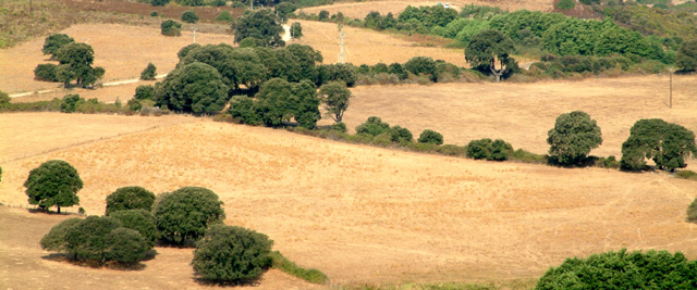
It was not possible to put some sky in there, there are hills and a gulf in the background, the sky is too far.
Image sharpness : I forgot to sharpen the image before submitting it and my camera tends to produce soft images indeed.
I think I could have gotten a bit more depth of field with a smaller aperture but the fact that everything seems to be on the same plane is probably due to the zoom factor I used (this is a really cropped part of the original picture)
Cheers |
|
|
|
08/27/2003 03:35:38 AM |
Hi...
I gave you a five on this shot...
I think you have an interesting scene here, but the shot doesn't draw me in...
The details seem a little soft. Could be a focus issue, or a post processing (downsize to submit, without sharpening??).
Nice colors and you've got the potential for a fun shot. Worth revisiting...
JD Anderson |
|
|
|
08/27/2003 01:33:30 AM |
| Needs a bit more field of depth. It look like the everything is almost on the same plane. Some sky would add some depth also. |
|
|
|
08/27/2003 12:43:45 AM |
| Hello. For this, I gave you a 5. The picture has pleasing lines that seem to draw a "z" across the field. However, the exposure is a bit too much, creating a very harsh blown-out effect on the majority of the pic. It also needs a little more color saturation - or if you prefer, just desaturate all together and just make it a nice sepia or b/w. Finally, there's a need to sharpen it up a bit to create more interest in the overall texture of the composition. Good to see you here in DPC! |
|
|
|
08/27/2003 12:16:59 AM |
Phillippe!
I was just looking at the challenge finishes since I didn't vote. I'm shocked to see you received NO comments on this, yet you must be wondering why this score. I like this shot for the following reasons:
the colours remind of the parched colours of summer, and the lines and dots of green bushes break up the monotone.
The problems I see with it are:
there isn't a significant point of interest and not enough in the shapes and lines we do see to keep attention. Its just sort of a background without a subject.
Overall, I think its a great effort for your first entry, congratulations on your socre, and I hope to see more from you soon! :) Don't be discouraged at the lack of comments, either! If all else fails, ask for some in the forums. Many people are happy to oblige.
Message edited by author 2003-08-27 12:14:30. |
|
|
|
08/27/2003 12:15:38 AM |
I'm commenting because you received zero comments!
First of all, I gave you a 4. I think there's something wrong with the focus and I don't think this represents any one season to me. It is, however, a decent looking subject and there are nice colors. Maybe something as a subject in this nice landscape would have made it stand out?
Happy shooting,
Mav |
|
Home -
Challenges -
Community -
League -
Photos -
Cameras -
Lenses -
Learn -
Help -
Terms of Use -
Privacy -
Top ^
DPChallenge, and website content and design, Copyright © 2001-2026 Challenging Technologies, LLC.
All digital photo copyrights belong to the photographers and may not be used without permission.
Current Server Time: 02/01/2026 11:20:05 AM EST.