| Author | Thread |
|
|
06/06/2006 04:00:48 PM |
Hello from the Critique Club
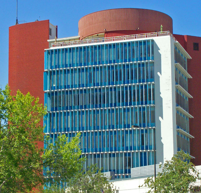
My first impression of this shot is that it doesn't stand out from the crowd. Although the building itself does represent a unique architecture, there are a few elements in this photo that really brought it down.
First off, I think the composition of this shot is not very flattering. The trees, light post, and small building in the foreground all are terribly distracting from the subject. They give this photo a cluttered feeling that steals the all important POP factor. This perspective is what anyone walking or driving by this building would see, and because of that, makes this shot seem ordinary. If there were a building facing this one, it would have been worth the effort to try and take the picture from on top of that building. This would have brought the viewer to a new perspective that would have been out of the ordinary and helped bring this shot more interest.
The lighting is also a little harsh. Adjusting the brightness down a bit would help a lot. I very much like the blue and red of the building against the blue sky, but the white facade seems almost over exposed The white with the sharp shadows grab my attention and and keep pulling me away from the more pleasing blue and red.
I think to improve this shot I would try two things. A different perspective, and shooting at a different time of day. How does this building look at night, or maybe on a partly cloudy day?
Please feel free to PM me if you have any questions!
-Bill |
|
 Photographer found comment helpful. Photographer found comment helpful. |
Comments Made During the Challenge  |
|
|
06/02/2006 02:37:41 PM |
| This building definitely has potential for some interesting images, but from this distance it is a bit overwhelming in color and components. Some portions seem overly sharp while others seem too soft in focus. 5 |
|
| Photographer found comment helpful. |
|
|
05/31/2006 06:05:33 PM |
|
| Photographer found comment helpful. |
|
|
05/31/2006 03:14:33 AM |
| This photo brings out the brilliant lines and colors of the building. I think it would have been stronger if the disttracting building at the bottom had bee cropped out. |
|
| Photographer found comment helpful. |
|
|
05/30/2006 08:26:50 AM |
| I love the blues of the windows & sky. Quite a jewel of a building! :) |
|
| Photographer found comment helpful. |
|
|
05/30/2006 12:59:56 AM |
| very out of the camera image....7 |
|
| Photographer found comment helpful. |
|
|
05/29/2006 12:56:23 PM |
| Bit of a standard shot, but not bad. |
|
| Photographer found comment helpful. |
|
|
05/28/2006 10:54:13 PM |
| seems to have some noise. Otherwise it is well done. |
|
| Photographer found comment helpful. |
Home -
Challenges -
Community -
League -
Photos -
Cameras -
Lenses -
Learn -
Help -
Terms of Use -
Privacy -
Top ^
DPChallenge, and website content and design, Copyright © 2001-2025 Challenging Technologies, LLC.
All digital photo copyrights belong to the photographers and may not be used without permission.
Current Server Time: 04/07/2025 02:20:18 AM EDT.