| Author | Thread |
Comments Made During the Challenge  |
|
|
06/04/2006 07:53:18 AM |
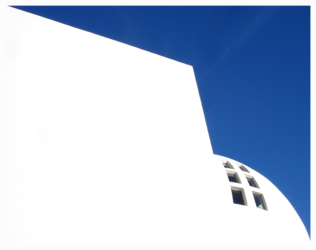
| Brilliant idea. The flat white gives a definite 2D feel, which sets up tension with the obvious 3D curvature of the windows. Ã�smundarsafn in ReykjavÃk? |
|
 Photographer found comment helpful. Photographer found comment helpful. |
|
|
06/03/2006 05:07:48 PM |
| very nice minimalist composition |
|
| Photographer found comment helpful. |
|
|
06/03/2006 04:17:38 PM |
| Too blown out for my taste |
|
| Photographer found comment helpful. |
|
|
06/03/2006 04:16:33 PM |
| Would be a good abstract photo but for architecture it leaves too much for the imagination. |
|
| Photographer found comment helpful. |
|
|
06/03/2006 05:39:54 AM |
|
|
|
06/02/2006 03:01:17 PM |
| Minimal and appealing capture. Nice contrast between the blue and white. |
|
| Photographer found comment helpful. |
|
|
06/01/2006 05:06:02 PM |
| As a contemporary style, this is great. The simple white and blue, with very little detail works well for the cosmopolitan lifestyle. I like the fact that the windows show some detail. Makes you wonder what is inside. |
|
| Photographer found comment helpful. |
|
|
06/01/2006 07:07:35 AM |
|
| Photographer found comment helpful. |
|
|
06/01/2006 05:52:41 AM |
| great simplicity in the shot...well done, I hope you do well with this image |
|
| Photographer found comment helpful. |
|
|
06/01/2006 02:03:55 AM |
| very arty !! Nice angle . I love the contrast of the blue and white. |
|
| Photographer found comment helpful. |
|
|
05/31/2006 06:14:11 PM |
|
| Photographer found comment helpful. |
|
|
05/31/2006 10:16:13 AM |
| I'm guessing you blew it out on purpose, but I'd like some detail in the white, especially with so little in the sky. |
|
| Photographer found comment helpful. |
|
|
05/31/2006 05:42:05 AM |
| Interesting idea, but it comes out with too much white space. Even if there were brick lines or something, it would work better - but too much is just blown white. |
|
| Photographer found comment helpful. |
|
|
05/29/2006 08:06:31 AM |
| mmm, liking this one alot |
|
| Photographer found comment helpful. |
|
|
05/28/2006 09:29:00 PM |
| Im not too fond of the blown out white taking up most of the photograph.. |
|
|
|
05/28/2006 09:00:59 PM |
|
| Photographer found comment helpful. |
|
|
05/28/2006 09:00:00 PM |
| Simply perfect. Maybe could have darkened clouds leaving sky completely blue for a better contrast look. Well done. |
|
| Photographer found comment helpful. |
Home -
Challenges -
Community -
League -
Photos -
Cameras -
Lenses -
Learn -
Help -
Terms of Use -
Privacy -
Top ^
DPChallenge, and website content and design, Copyright © 2001-2025 Challenging Technologies, LLC.
All digital photo copyrights belong to the photographers and may not be used without permission.
Current Server Time: 04/07/2025 09:29:59 PM EDT.