| Author | Thread |
Comments Made During the Challenge  |
|
|
07/20/2002 09:38:00 PM |
| Good idea but you abused filtering |
|
|
|
07/20/2002 01:44:00 PM |
| Did you achieve the color effect with hardware or software? |
|
|
|
07/19/2002 10:21:00 AM |
|
|
|
07/18/2002 09:41:00 PM |
| I like this. I can feel the heat... |
|
|
|
07/18/2002 02:17:00 PM |
| An overuse of filters and somewhat dizzying. |
|
|
|
07/17/2002 01:06:00 PM |
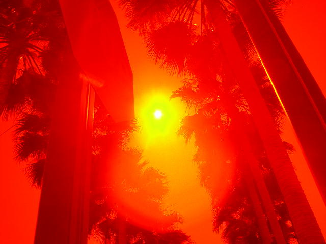
| Strikingly red, overpoweringly red. I like the effect, maybe a touch over the top, but it still looks good. I would have thought the palm leaves would have not been so visible in the sun corona, that's my favorite part. 8 Swash |
|
|
|
07/17/2002 12:23:00 PM |
| the red is a great color for summer heat... |
|
|
|
07/17/2002 10:32:00 AM |
This could be one of those 'webshots' wallpaper pics! Great work. I almost (slightly almost) don't care too much for it, yet it draws you in. Reminds of a Florida postcard. Great work!
Ruthann |
|
|
|
07/17/2002 10:13:00 AM |
| Cool !...or Hot! actually... This is so great! |
|
|
|
07/17/2002 09:22:00 AM |
| really nice lighting effect. I'm roasting just looking at it. |
|
|
|
07/17/2002 05:38:00 AM |
| This may be a great shot, but if so, it's over my head. (Which is not your fault of course) The first thing that popped into my mind when I saw it was "too intense". I can't make out what the two poles in the foreground are (stop sign on left? Another sign on the right?) but I understand that you may not have MEANT for me to see them clearly. But it all went over my head I'm afraid. |
|
|
|
07/17/2002 03:43:00 AM |
| whew! I can feel it....where's the lemonade |
|
|
|
07/16/2002 09:15:00 PM |
| nice use of colours to represent heat.. |
|
|
|
07/16/2002 01:31:00 PM |
|
|
|
07/16/2002 06:35:00 AM |
| Interesting stuff going on here. I kinda like the effect, but I think you took it a little too far. |
|
|
|
07/16/2002 05:23:00 AM |
| the red filter certainly turns up the temp in this shot... |
|
|
|
07/16/2002 02:33:00 AM |
| I like this image but I think the red is quite overpowering... I would love to see that toned down just a little... = 6 - jmsetzler |
|
|
|
07/16/2002 01:12:00 AM |
| eek, That's a good representation of heat! Maybe a bit too bright though - but it gets the point across, 6 |
|
|
|
07/15/2002 05:15:00 PM |
| Nice use of color to make the meaning of the photo match your title :) You really do get a feeling of being hot. |
|
|
|
07/15/2002 04:07:00 PM |
| Although interesting, I found this photo to be way too intense for me. |
|
|
|
07/15/2002 02:58:00 PM |
| Really conveys your message. Good job. |
|
|
|
07/15/2002 11:59:00 AM |
|
|
|
07/15/2002 11:34:00 AM |
"It's more than it appears to be" - Beatles miss quoted. :-)
I like it, I don't know how you did it but I do like it. One of my top picks. |
|
|
|
07/15/2002 11:04:00 AM |
| Nice. Catches the mood & temp. |
|
|
|
07/15/2002 10:40:00 AM |
| It certainly relays the idea of extreme heat. I'd be interested in knowing how you blocked the red filter just for the sun and it's halo, and the few highlights, if you're comfortable sharing the information (crisa58@yahoo.com) There's a large-ish object intruding on the upper left to left middle. I wish it weren't there, that the palms were visible. But all in all a wonderful shot! |
|
|
|
07/15/2002 08:20:00 AM |
| This is good. It looks HOT |
|
|
|
07/15/2002 07:27:00 AM |
|
|
|
07/15/2002 03:49:00 AM |
| I like this. I have felt like there was just too much sun before. Very nice job. |
|
|
|
07/15/2002 03:26:00 AM |
|
|
|
07/14/2002 08:20:00 PM |
|
Home -
Challenges -
Community -
League -
Photos -
Cameras -
Lenses -
Learn -
Help -
Terms of Use -
Privacy -
Top ^
DPChallenge, and website content and design, Copyright © 2001-2025 Challenging Technologies, LLC.
All digital photo copyrights belong to the photographers and may not be used without permission.
Current Server Time: 04/07/2025 12:06:14 AM EDT.