| Author | Thread |
|
|
08/25/2003 09:14:55 AM |
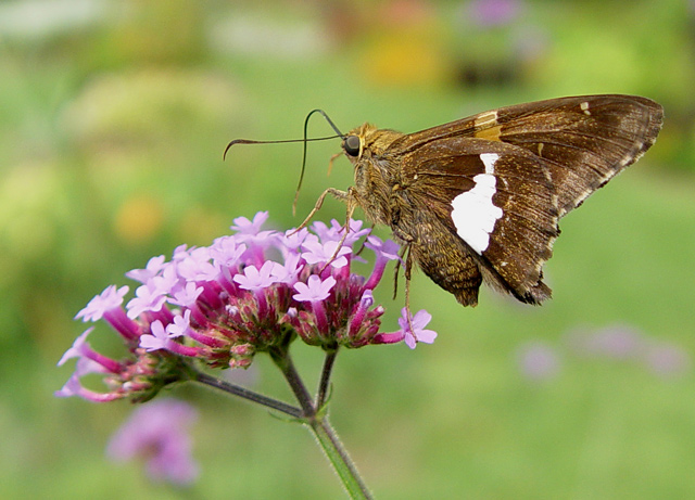
I have to sort of agree with Kevin in that the negative space isn't adding a lot to the shot IMO. You also have to keep in mind that many voters think of negative space as just plain empty space which may account for a few of those low votes. At least there aren't any 1s! I'll admit that I gave this picture a 5. Technically it IS good, but it just doesn't have enough "wow" to make it stand out. Everyone should remember that a good competition shot isn't always the same as just a great picture. You have to grab the voters.
(This also looks like a moth, and I hate moths :P ) |
|
|
|
08/25/2003 08:42:51 AM |
Terry,
I posted these comments in response to your request in a forum thread about this challenge (//www.dpchallenge.com/forum.php?action=read&FORUM_THREAD_ID=40433&PHPSESSID=7dcb27baea25a3e53744a87cce1f1e86).
You mentioned that this post was similar to your post for the first Negative Space and that the first one scored better. For myself I scored this image a 5 and probably would have scored the image for the first challenge higher. Here's why. The goal of the Negative Space II challenge was that the negative space should create the WOW of the image and this one falls short not because your subject isn't centered or is a macro. This submission doesn't meet the bar because the background (your negative space) contains elements that make it resonate with the foreground (the main subject). Thus, your negative space doesn't make your main subject stand out in a powerful manner; rather, it gives some continuity from your subject to the background. My points would be that the pinkish hue in the flower is replicated below and to the right of it. Likewise the maize-colored areas on the butterfly's head and one spot on the wings seems to harmonize with the yellow-tan colors in the top left of this image. In contrast, the image you submitted for the original Negative Space challenge (link) had a vibrant difference between the pink flowers of your main subject and the blurred space caused by the narrow DOF. You might have played with the colors in that submission to desaturate the yellows and generate a version that I would find even stronger but IMO it is a better presentation of this effort. I think you used a good technique but because of the blurred colors surrounding your subject in this submission you watered down the methodology you used to make your subject stand out.
Message edited by author 2003-08-25 12:43:14. |
|
|
|
08/25/2003 07:43:15 AM |
| OK maybe this was not the most unique use of negative space, but it did meet the challenge. Negative space, when used properly, defines the positive space. My use, in fact did that. If I would have chosen a different DOF, my image would not have had the same impact. My technical aspects were quite good, something that lately gets overlooked. This photo did not deserve 2's 3's and 4's.I think the voters on this one were a little harsh, but that's the DPC audience for you..... |
|
Comments Made During the Challenge  |
|
|
08/24/2003 04:49:35 PM |
| Great macro shot, but not so much Negative Space... |
|
|
|
08/24/2003 01:56:22 PM |
I would like to have the colors more vivid, it is maybe too gray?
check out the Hue/Saturation pallette in PS...
good luck in the challange. |
|
|
|
08/19/2003 06:29:45 PM |
| Love the shallow DOF. Makes for a very pleasing background. Jacko. 8 |
|
|
|
08/19/2003 12:06:14 PM |
| I'm giving this image a 6 and I want to explain why. This is a great shot and that is why I give it a high score. The use of negative space in this challenge, however, is not as strong as I would like for this challenge. Otherwise I would rate this image even higher. Very nice capture. |
|
|
|
08/18/2003 11:49:30 AM |
| Nice colors and moth detail! Making the moth smaller and moving to one of the thirds would add more obvious negative space (but you'd lose some of the detail). It would also help the negative space imply the world the moth is a part of. This is a nice insect shot! |
|
|
|
08/17/2003 09:02:23 PM |
| the space around the subject should be the wow. |
|
|
|
08/17/2003 08:46:35 PM |
| I'm not sure that it's the negative space that makes the wow of the shot. It seems like a standard macro shot to me. Not saying it doesn't qualify but it isn't using the negative space to do something unique or spectacular. |
|
Home -
Challenges -
Community -
League -
Photos -
Cameras -
Lenses -
Learn -
Help -
Terms of Use -
Privacy -
Top ^
DPChallenge, and website content and design, Copyright © 2001-2025 Challenging Technologies, LLC.
All digital photo copyrights belong to the photographers and may not be used without permission.
Current Server Time: 04/08/2025 01:32:42 AM EDT.