CRITIQUE CLUE CRITIQUE
by karmat
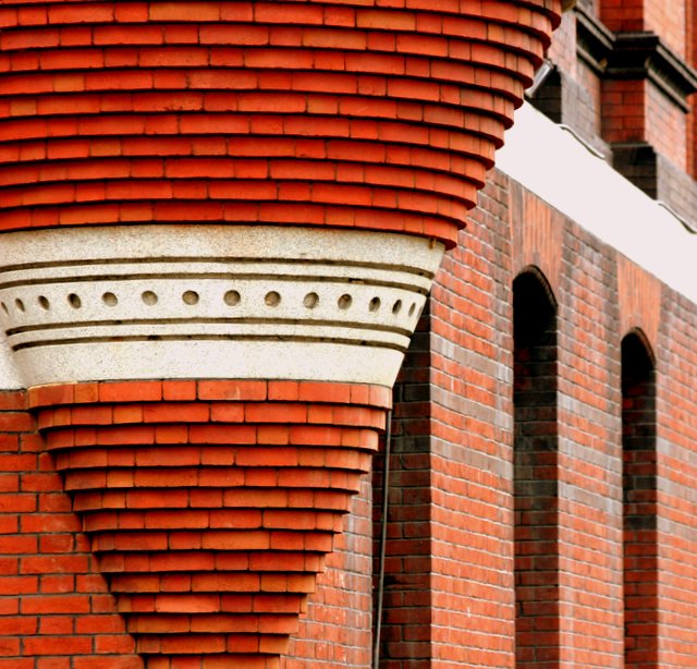
That, indeed, is some impressive brick masonry. Very nice capture.
Compositionally, I like how the "cone" anchors the shot on the left, and then the eye is drawn to the right through the picture. If possible, I think it might have been more effective to go wider and not cut the top part of the cone off, but still maintaining the progression on the right side of the frame. Not sure if that was possible, but that is what my eye "feels" like it should be seeing.
Technically, I love the read color of this, and the more shallow depth of field works well to isolate the cone from the rest of the building.
Overall, I think it is a good shot that meets the challenge. It does lack a certain amount of "punch" that reaches out and grabs the viewer and makes them sit and stare in awe at it. In other words, it is a strong brick structure, but it doesn't really have an appeal to the general masses of people. Does that make sense? Perhaps more context in the shot (again, if possible) would have given the shot that little extra edge to be more appealing.
Good work. |