| Author | Thread |
|
|
10/16/2006 10:02:34 AM |
Steve,
Cool choice for architecture. It's nice to have another area photographer as a member.
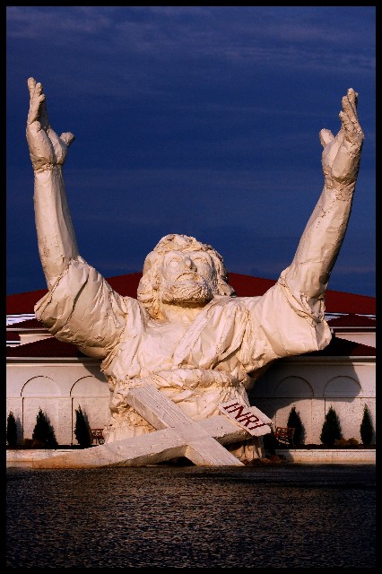
I agree, it appears Jesus is not quite in focus or has movement of the camera or something. I do like the deep blue sky.
Here's my take on this statue back in 2005 when I was doing my Photo a Day project (there are two smaller thumbnails further down on that page as well.)
Jesus Statue
I'm waiting for some adventurous soul to put Bengals colors and a banner on him or something like that. |
|
 Photographer found comment helpful. Photographer found comment helpful. |
|
|
07/19/2006 02:59:07 PM |
| HAHAHA..StyroJesus!! I pass this guy every night on the way to work. Great pic! |
|
| Photographer found comment helpful. |
|
|
07/18/2006 02:28:05 PM |
| Amazing! Never saw that before. |
|
| Photographer found comment helpful. |
|
|
06/26/2006 09:38:44 PM |
This is the "touchdown" Jesus on I75 just outside of Cinncy. We drive by it every year on our way to Disney World from Toronto Canada. It is an important landmark of our yearly journey. I am glad you posted this. It is refered to as the "Touchdown Jesus" for obvious reasons. :D
Great shot
Coley |
|
| Photographer found comment helpful. |
|
|
06/06/2006 03:14:21 PM |
::: Greetings from Critique Club :::
Hi, as requested, here is an indepth critique of your submission.
First Impression - the most important one:
That is one awesome Jesus statue :-) I like this photo, definitely stands out.
Composition:
I like that you centered the compostion horizontally. I think your choice of composition works here.
Subject:
Right there in your face. Not hard to miss.
Technical (Color, focus, and light):
Focus is good, but it looks like you may have over-sharpened a bit in post-process.
I like the color of the image, especially the blue sky and red roof.
I'm not real fond of the lighting though. The shadows are kind of harsh. I'd like to see this shot at a different time of day or at night (if there are any spot lights on the Jesus).
To grow its vote?:
I think you may have over-processed the image. It comes off as a bit dark.
Summary:
I like the photo, a few minor improvements could elp it, but overall it's COOL!
Hope to see more from you soon,
Leroy |
|
| Photographer found comment helpful. |
Comments Made During the Challenge  |
|
|
06/04/2006 01:43:02 PM |
| very different... tough to tell scale though. 7 |
|
| Photographer found comment helpful. |
|
|
06/03/2006 08:30:19 PM |
I can't tell if the image is out of focus, over processed, or if it has some other problem, but it isn't crisp and clean the way I would expect from an architecural photo. A very interesting subject none the less.
Message edited by author 2006-06-05 01:11:42. |
|
| Photographer found comment helpful. |
|
|
06/02/2006 05:37:48 PM |
| Lovely..I can't wait to see where this is |
|
| Photographer found comment helpful. |
|
|
05/31/2006 01:14:18 AM |
| Wow amazing shot. I have never seen this before and I so glad you entered it. |
|
| Photographer found comment helpful. |
|
|
05/30/2006 11:58:42 PM |
|
| Photographer found comment helpful. |
|
|
05/30/2006 08:10:07 AM |
| I like the warmth on the hands; this composition makes you take notice; alternate title "why did you forsake me father and give Tom hanks the lead in the Da Vinci Code" |
|
| Photographer found comment helpful. |
|
|
05/29/2006 09:25:43 AM |
| Amazing image, Amazing building. All that white and not a single blown out hightlight. Great job. |
|
| Photographer found comment helpful. |
Home -
Challenges -
Community -
League -
Photos -
Cameras -
Lenses -
Learn -
Help -
Terms of Use -
Privacy -
Top ^
DPChallenge, and website content and design, Copyright © 2001-2026 Challenging Technologies, LLC.
All digital photo copyrights belong to the photographers and may not be used without permission.
Current Server Time: 02/01/2026 12:02:17 PM EST.