| Author | Thread |
Comments Made During the Challenge  |
|
|
05/22/2006 08:58:02 PM |
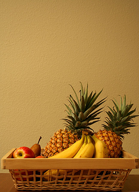
| Nice combination of colors. |
|
|
|
05/22/2006 12:53:23 PM |
| Negative space at top really doesn't add anything to image. |
|
|
|
05/20/2006 05:40:28 PM |
| I would have liked this better with either grapes spilling over the edge of the basket or some fruit on the table in front of the basket. It also seems too yellow, too tightly cropped on the sides, and too much dead space at the top. 5 |
|
|
|
05/19/2006 02:19:34 AM |
| nice coloring,and sharp...8 |
|
 Photographer found comment helpful. Photographer found comment helpful. |
|
|
05/18/2006 02:00:42 PM |
| I like the colours and arrangement of the fruit. Don't like the too close crop on the bottom and sides. |
|
| Photographer found comment helpful. |
|
|
05/18/2006 09:01:49 AM |
| This meets the challenge – it’s inanimate and arranged. Quite classic and simple. Either the white balance or the colour saturation might be adjusted to get things more real and less plastic. You could tilt the basket, too - it hides too much. 6 |
|
| Photographer found comment helpful. |
|
|
05/17/2006 11:17:53 PM |
|
|
|
05/17/2006 03:46:25 PM |
| Was going to comment on the right-side crop tightness, then guessed by the tiny sliver on the bottom that you had to rotate and had to crop more than you planned. I always try to give myself a bit of extra space in case of that. (I'm notorious for taking tilted horizons). Otherwise I love this and am rating it in my higher group. |
|
| Photographer found comment helpful. |
|
|
05/17/2006 11:40:10 AM |
| The composition on thes isn't really right. It's very heavy on the bottom. |
|
| Photographer found comment helpful. |
|
|
05/17/2006 08:32:34 AM |
| is ti me or is the shot slighlty lob sided, nice composition though |
|
| Photographer found comment helpful. |
|
|
05/17/2006 05:30:53 AM |
| crop at sides and bottom is too tight, while it's too loose at the top, white balance is off, structure of wall is distracting |
|
|
|
05/17/2006 03:33:40 AM |
| Nice colour and sharp focus the image is nice |
|
| Photographer found comment helpful. |
|
|
05/17/2006 12:39:02 AM |
| I like the arrangement you made, with the two pineapples. The wall texture is nice and interesting and your composition forces us to look at it as a relevant part of the photo. |
|
| Photographer found comment helpful. |
Home -
Challenges -
Community -
League -
Photos -
Cameras -
Lenses -
Learn -
Help -
Terms of Use -
Privacy -
Top ^
DPChallenge, and website content and design, Copyright © 2001-2026 Challenging Technologies, LLC.
All digital photo copyrights belong to the photographers and may not be used without permission.
Current Server Time: 02/01/2026 11:47:33 AM EST.