| Author | Thread |
Comments Made During the Challenge  |
|
|
05/23/2006 06:58:55 PM |
| Nice idea, but the creased background is distracting. |
|
 Photographer found comment helpful. Photographer found comment helpful. |
|
|
05/21/2006 07:53:48 PM |
| nice and simple with good lighting and colour |
|
| Photographer found comment helpful. |
|
|
05/21/2006 07:07:53 PM |
|
| Photographer found comment helpful. |
|
|
05/21/2006 07:43:27 AM |
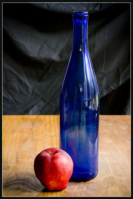
| Not sure about the title, but I like the picture. I think I'd call it "A Study in Red and Blue on Wood" |
|
| Photographer found comment helpful. |
|
|
05/20/2006 06:16:01 AM |
| nice image, IMO if the backdrop was flatter (i dont mean ironed flad but the large curved removed) and more out of focus it would have made the subject stronger. |
|
| Photographer found comment helpful. |
|
|
05/19/2006 04:30:53 PM |
| iron your backdrop next time 7 |
|
| Photographer found comment helpful. |
|
|
05/18/2006 03:23:59 PM |
| IMHO A narrower DOF would improve this even further. |
|
| Photographer found comment helpful. |
|
|
05/18/2006 02:43:20 PM |
| I want to reach out and wipe off the table. I guess that's a good thing. This is a very painterly composition. Nice. I only wish the back edge of the table was sharper. |
|
| Photographer found comment helpful. |
|
|
05/18/2006 05:19:37 AM |
| Great lighting. I think what hurts it is the wrinkled backdrop and the wood texture of the table. I like the reflection in the bottle. At least you "got it." Many did not. |
|
| Photographer found comment helpful. |
|
|
05/18/2006 03:19:17 AM |
| This meets the challenge � it�s inanimate and arranged. The composition and the simplicity are good. An even wider aperture for shallower depth of field, if it were possible, might have improved the picture, as the background disracts a little. It's a strong six and I'm marking a hesitant 7 |
|
| Photographer found comment helpful. |
|
|
05/17/2006 01:14:49 PM |
| I like the colors. I don't know if you meant to leave the apple like it is in the picture, but I would have polished it to give it more effect. |
|
| Photographer found comment helpful. |
|
|
05/17/2006 11:23:14 AM |
| A little less dof to blur your background more would have made your subject stand out better. I like the contrasts in colour and shape. |
|
| Photographer found comment helpful. |
|
|
05/17/2006 10:30:20 AM |
| I think this would have popped more for me if the light wasn't as intense and the black backdrop showed up as pure black. Nice shot though. |
|
| Photographer found comment helpful. |
|
|
05/17/2006 10:11:08 AM |
| One of my favorites. Simple and elegant. |
|
| Photographer found comment helpful. |
|
|
05/17/2006 10:03:16 AM |
| Would have preferred the backdrop out of focus so the wrinkles are not visible. |
|
| Photographer found comment helpful. |
|
|
05/17/2006 07:15:04 AM |
| Background is only real problem for me. I'd have tried to throw it more out of focus or something to get rid of the ugly wrinkles. |
|
| Photographer found comment helpful. |
|
|
05/17/2006 03:19:59 AM |
| I like the set up but the wrinkles in the back are distracting & unattractive. Bigger aperture might have eased that. Colors are very nice too. |
|
| Photographer found comment helpful. |
Home -
Challenges -
Community -
League -
Photos -
Cameras -
Lenses -
Learn -
Help -
Terms of Use -
Privacy -
Top ^
DPChallenge, and website content and design, Copyright © 2001-2025 Challenging Technologies, LLC.
All digital photo copyrights belong to the photographers and may not be used without permission.
Current Server Time: 04/07/2025 06:05:57 AM EDT.