| Author | Thread |
Comments Made During the Challenge  |
|
|
05/25/2006 06:36:15 PM |
| I'm not Langdon's girlfriend. And also, I can totally see your post-processing. |
|
|
|
05/25/2006 06:21:41 PM |
| that is really cool, black and white works well |
|
|
|
05/25/2006 03:28:11 PM |
| I like the general idea here a lot but watch out for over sharpening. |
|
|
|
05/25/2006 09:38:09 AM |
| Effective. Like the composition. Could easily be a book cover! |
|
|
|
05/24/2006 05:54:09 PM |
|
|
|
05/21/2006 03:24:33 PM |
| This is a really neat idea. Unfortunately, it's quite pixelated, and I can see a spot just left of your position where there's an erratic mass of burn tool, I'm guessing? |
|
 Photographer found comment helpful. Photographer found comment helpful. |
|
|
05/21/2006 05:39:22 AM |
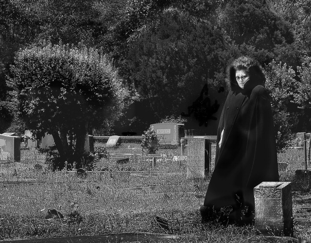
| I have an LCD monitor, calibrated so I can see every box at the bottom of this page. I think your monitor must be mis-calibrated, maybe in contrast. I can see the marks of dodge and burn here - lightening of the face and some trees, darkening of some shadows in the trees and your cape. And the contrast is a little flat. Speaking from experience (this has happened to me too many times to mention), I would suggest editing in a bright room (when I edit at night with the lights out, I have the same issues). The base image itself is good - composition good, sharpness, detail, POV good, you just need to be aware of ambiant light and its effects on what you see in your monitor. Its a shame that a good image and good photographer can be held back by technical issues... I'm giving you a 6 for the base image (overlooking the post processing) since I'm pretty sure it was not bad editing. |
|
| Photographer found comment helpful. |
|
|
05/20/2006 06:14:32 PM |
|
| Photographer found comment helpful. |
|
|
05/20/2006 05:15:54 PM |
| Interesting concept. Would have been a lot better earlier in the morning or at dusk when the light is less harsh. Looks like it was taken at noon, with no shadows showing. It's the interplay of light and shadows that makes a photo appealing and have a wow factor. Also looks oversharpened and there's a white "Nike" streak on the coat from ?over-dodging or ?jpg compression. Hope this helps for your next entries. |
|
| Photographer found comment helpful. |
|
|
05/20/2006 04:01:13 PM |
| grass appears over-sharpened, and the robe is splotchy. Looks like sloppy dodging and burning. |
|
|
|
05/20/2006 03:07:28 PM |
| This photo has some obvious editing flaws that show in the photo. I might recommend that you check your editing monitor for calibration. Nice setup and good attempt though. But the spot editing is pretty obvious with the flaws. |
|
| Photographer found comment helpful. |
|
|
05/20/2006 09:41:52 AM |
| The post processing on this shot is poorly done...and there appears to be a light coloured swoosh over the black coat. |
|
|
|
05/19/2006 03:40:24 PM |
Time to get the monitor calibrated.
There are so many badly visible marks from processing here, (whether it was burning/dodging/painting/cloning, whatever), that I suspect that you couldn't see them on your end.
Unfortunately, I can, and I suspect most other people will be able to as well.
Nice concept.. but marred badly by visible processing. |
|
| Photographer found comment helpful. |
|
|
05/19/2006 03:35:31 PM |
|
| Photographer found comment helpful. |
|
|
05/19/2006 03:50:21 AM |
| Holy moly - you're not kiddin', that does look wicked. Great shot and great choice of BW! |
|
| Photographer found comment helpful. |
|
|
05/19/2006 03:40:16 AM |
| I like the grainy effect, it goes well with the theme. The pose, costume and setting look kind of stagey, though. |
|
| Photographer found comment helpful. |
|
|
05/18/2006 09:17:22 PM |
|
| Photographer found comment helpful. |
|
|
05/18/2006 08:53:23 PM |
| Great out of the box image. Good to see the imagination run rampent here. blacks are a bit too black, whites need work. |
|
| Photographer found comment helpful. |
Home -
Challenges -
Community -
League -
Photos -
Cameras -
Lenses -
Learn -
Help -
Terms of Use -
Privacy -
Top ^
DPChallenge, and website content and design, Copyright © 2001-2025 Challenging Technologies, LLC.
All digital photo copyrights belong to the photographers and may not be used without permission.
Current Server Time: 04/11/2025 01:09:00 AM EDT.