| Author | Thread |
Comments Made During the Challenge  |
|
|
05/16/2006 11:48:42 PM |
| Unfortunately, this lacks interest and the perspective is a bit different. The diagonals, while interesting and makes the photo dynamic can only add a little bit of visual play. |
|
|
|
05/16/2006 06:00:54 PM |
| contrived shot. lacks believability. has some nice textures. |
|
|
|
05/12/2006 12:23:34 PM |
| Not sure I like the angle. Image is nice and clear but nothing pops out at me as being overly interesting. |
|
 Photographer found comment helpful. Photographer found comment helpful. |
|
|
05/12/2006 02:47:03 AM |
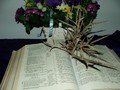
| It's a nice literary set up to picture the symbols of belief in the catechism, on which belief its holiness is dependent. I think the problem is that anything that departs from the 'obvious' interpretation of the challenge has to stand out as exceptional. This isn't better than good. Come to think of it, I'll vote you an extra point for the well composed simplicity. |
|
| Photographer found comment helpful. |
|
|
05/11/2006 10:26:58 PM |
| While the subjects chosen relate to the challenge, the framing, composition & lighting offer little interest to the viewer - 2 |
|
| Photographer found comment helpful. |
|
|
05/11/2006 04:19:34 PM |
| why is this the holiest of places? is that a jello shot? |
|
|
|
05/11/2006 02:14:46 PM |
| Maybe a tighter crop? The angle of the dark wood also leads ones eye out of the pic. A frame would help with that. |
|
| Photographer found comment helpful. |
|
|
05/10/2006 10:53:51 PM |
| Interesting composition, but unfortunately the harsh lighting makes it feel like a cheap snapshot, which I doubt was your intent |
|
| Photographer found comment helpful. |
|
|
05/10/2006 05:04:47 PM |
| This is a simple and neat concept. I like the photo, however IMHO I think it would have worked better with a backdrop or lightly draped fabric behind instead of the white wall and a fill card to help with the shadow cast. |
|
| Photographer found comment helpful. |
|
|
05/10/2006 01:12:22 AM |
| Sometimes simplicity is ideal, and the holiest. I like the concept a lot. |
|
| Photographer found comment helpful. |
Home -
Challenges -
Community -
League -
Photos -
Cameras -
Lenses -
Learn -
Help -
Terms of Use -
Privacy -
Top ^
DPChallenge, and website content and design, Copyright © 2001-2026 Challenging Technologies, LLC.
All digital photo copyrights belong to the photographers and may not be used without permission.
Current Server Time: 02/01/2026 11:49:15 AM EST.