| Author | Thread |
|
|
04/16/2010 12:46:52 PM |
| Lovely portrait, you've captured something soulful and enigmatic. |
|
 Photographer found comment helpful. Photographer found comment helpful. |
|
|
01/31/2007 03:29:17 PM |
Originally posted by LevT:
Now I print mostly 12x18 (the maximum Epson R2400 permits). |
Is it worth more than convenience to have a printer? I'm sitting on the fence about getting one. I print mostly 8x12 at a lab, and I am not completely happy with their quality, especially for B&W prints, they always have a barely visible, but still, unwanted tint (used to be red, now it's blue). ;) I wonder what is better - switch my lab to a better one, or buy my own printer. I never need to have a print "right now".
Message edited by author 2007-01-31 20:30:02. |
|
| Photographer found comment helpful. |
|
|
01/31/2007 12:59:52 PM |
| Superb lighting. Makes me think of an Annie Liebowitz photo. |
|
| Photographer found comment helpful. |
|
|
01/31/2007 12:58:30 PM |
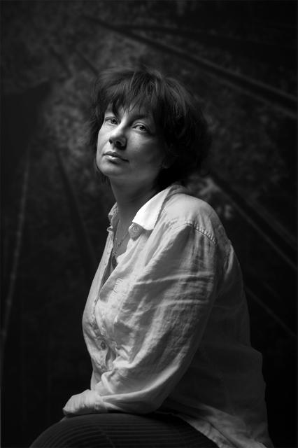
Originally posted by agenkin:
Congratulations! A nice portrait, love the shadows on the shirt's sleeve, although it looks like you overexposed the collar and the nose (the top light too strong?). The back of the head blends into the background - it would be nice to separate them by back lighting or in some other way.
How large did you print for the exhibition? |
Thanks Arcady! if only I had multiple lights... :) it was a single light (a striplight I think) with a reflector. Maybe now I have a justification to go and buy another strobe :). I think I did not have the nose "blown out" in the print, it may be the way it is saved in this small JPEG, but have to check it. Overexposing the collar does not bother me too much, even if it is there. The print is I think 15x20 in 20x24 frame, had it printed in the lab way back last year when I did not have my own printer. Now I print mostly 12x18 (the maximum Epson R2400 permits). |
|
|
|
01/31/2007 12:47:04 PM |
Congratulations! A nice portrait, love the shadows on the shirt's sleeve, although it looks like you overexposed the collar and the nose (the top light too strong?). The back of the head blends into the background - it would be nice to separate them by back lighting or in some other way.
How large did you print for the exhibition? |
|
| Photographer found comment helpful. |
|
|
01/31/2007 12:38:01 PM |
What stunning lighting. It's perfect! Congratulations on being rewarded with top honors for this great portrait! I bet she is delighted too!
|
|
| Photographer found comment helpful. |
|
|
08/26/2006 09:46:08 AM |
| Wow, it's amazing what a slight change can make. There is so much more depth and interest to this photo now. The first edit was good, but you've taken it to a whole new level with this version. Quite lovely. |
|
| Photographer found comment helpful. |
|
|
08/26/2006 07:04:14 AM |
this is a wonderful portrait!
I haven't seen the earlier version, but would say this one is expertly handled...
I looked..yes this is WAY better...
Message edited by author 2006-08-26 11:05:24. |
|
| Photographer found comment helpful. |
|
|
05/08/2006 07:37:01 AM |
| i think this really adds a ton of visual interest when compared to the first shot. |
|
| Photographer found comment helpful. |
Home -
Challenges -
Community -
League -
Photos -
Cameras -
Lenses -
Learn -
Help -
Terms of Use -
Privacy -
Top ^
DPChallenge, and website content and design, Copyright © 2001-2025 Challenging Technologies, LLC.
All digital photo copyrights belong to the photographers and may not be used without permission.
Current Server Time: 04/09/2025 04:30:07 PM EDT.