| Author | Thread |
Comments Made During the Challenge  |
|
|
08/19/2003 07:16:10 PM |
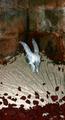
| This person is not happy. The image is a bit pixellated and jaggy, but it's a good shot. The border does nothing for me though. [5] |
|
|
|
08/19/2003 03:51:33 AM |
| looks better if the upper portion is not cut,only suggestion..its a nice composition |
|
|
|
08/17/2003 04:54:56 AM |
| This could have been an excellent picture but the quality of image leaves a lot to be desired |
|
|
|
08/17/2003 12:51:31 AM |
| Very sad picture. It's a little blurry, but it still gets the point across....good job!!! |
|
|
|
08/15/2003 11:01:35 PM |
| This gives me a strong feeling of desolation...I like it. Nice job! |
|
|
|
08/15/2003 10:52:10 PM |
| I see quite a few jaggies, especially along his shoulders adn the rail above. Seems like the picture might have been fuzzy and then was oversharpened to compensate. His hat and shirt both seem overexposed to me. |
|
|
|
08/15/2003 05:00:20 AM |
|
|
|
08/14/2003 12:36:55 AM |
| Get into focus and you would have a top-notch shot |
|
|
|
08/13/2003 10:20:31 AM |
|
|
|
08/13/2003 09:36:07 AM |
| this gets a big vote...old age can be desolate and that cataract-owned eye is powerful |
|
|
|
08/13/2003 07:33:54 AM |
Although a good composition, but the image is little out of focus. The brightness is on the higher side and contrast does'nt seem right. Maybe a fill-in-flash would have removed the dark shadows from the image and have made it much better.
DOF ... what happened to it.... considering that you wanted to highlight the background. Overall the picture is little weak in clarity and focus but I guess a B/W / sephia tone of the same image would have looked better. |
|
Home -
Challenges -
Community -
League -
Photos -
Cameras -
Lenses -
Learn -
Help -
Terms of Use -
Privacy -
Top ^
DPChallenge, and website content and design, Copyright © 2001-2026 Challenging Technologies, LLC.
All digital photo copyrights belong to the photographers and may not be used without permission.
Current Server Time: 02/01/2026 05:34:49 AM EST.