| Author | Thread |
|
|
08/03/2006 05:39:26 AM |
|
 Photographer found comment helpful. Photographer found comment helpful. |
|
|
07/02/2006 06:59:05 AM |
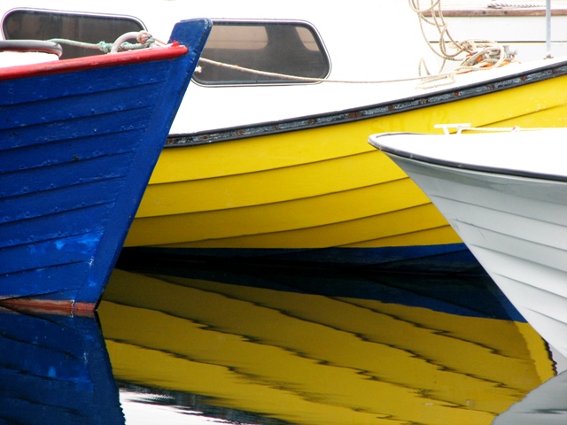
| Great colors and reflection... the composition gives this a very abstract feel! Lovely. |
|
| Photographer found comment helpful. |
|
|
05/14/2006 05:54:31 AM |
|
| Photographer found comment helpful. |
|
|
05/11/2006 04:57:00 AM |
From the CTP MkII
First Impression: I like it. Dynamic.
Composition: Like composition for this challenge, as you keep moving from one side of the image to other.
Subject: Beautiful. I love boats. Aren't they a wonderful subject for photography?
Technical: the colours are a little bit washed IMHO. I think they need some more saturation and texture, but maybe it's just my monitor. The white of the upper boat is blowed.
Improvement: It's a pitty it was basic editing, if not you could work a little bit more the boats to recover more colour.
Summary: Very good comp, very good for the challenge, needs a bit more saturarion and texture.
�lex
|
|
| Photographer found comment helpful. |
|
|
05/10/2006 11:03:03 PM |
Very colourful, which is always good:)
I like the way the boats 'overlap' the yellow one, it kinda frames the awesome reflection.
the top of the boat and the rope are a bit distracting, but if you crop it out then the pretty blue is lost...
Nice score and placing, well done:) |
|
| Photographer found comment helpful. |
|
|
05/10/2006 08:28:34 PM |
Hi Gunnar -
I like the rhythm of the boat lines - definitely a unique perspective on the challenge.
I'm not sure what to do about the overwhelming brightness of the white except maybe turn the shutter speed up a notch and let the color come out in post-production, perhaps via saturation and lightness controls? Overall, not a bad finish at 55, though. Good eye! |
|
| Photographer found comment helpful. |
|
|
05/10/2006 05:43:49 PM |
From comment trading post:
I really like the repetition of the lines on the boats. The reflection adds to the impact. The colors are nice and bright. The white top of the white boat takes away a tiny bit. Not much, though. Maybe cropping a bit lower would help?. Overall a very pleasing photo. |
|
| Photographer found comment helpful. |
|
|
05/10/2006 03:39:42 PM |
| það er nú alltaf gaman af svona bátamyndum |
|
| Photographer found comment helpful. |
Comments Made During the Challenge  |
|
|
05/08/2006 06:35:55 PM |
| reflection doubles impact. nice contrast in colors |
|
| Photographer found comment helpful. |
|
|
05/07/2006 08:51:17 PM |
|
| Photographer found comment helpful. |
|
|
05/06/2006 10:07:43 AM |
|
| Photographer found comment helpful. |
|
|
05/05/2006 02:45:56 AM |
| I like the bold colours and reflection. I might have cropped it below the wondows as they spoil the pattern a little. Still like it though. |
|
| Photographer found comment helpful. |
|
|
05/04/2006 04:37:50 AM |
|
| Photographer found comment helpful. |
|
|
05/04/2006 12:55:24 AM |
| huh? windows flying through the air? oh, no, it's just completely overexposed top sides of the boats. Only way to save this image is to crop off 40% at top and 5 % off the bottom |
|
| Photographer found comment helpful. |
|
|
05/03/2006 09:06:47 PM |
| Oooohh...I like the reflection...the colors...over all composition is great...nice work |
|
| Photographer found comment helpful. |
|
|
05/03/2006 07:16:31 PM |
| Nice contrasting (complementary) colors and reflection. I think I'd like to move back a little though. |
|
| Photographer found comment helpful. |
|
|
05/03/2006 04:23:18 PM |
|
| Photographer found comment helpful. |
Home -
Challenges -
Community -
League -
Photos -
Cameras -
Lenses -
Learn -
Help -
Terms of Use -
Privacy -
Top ^
DPChallenge, and website content and design, Copyright © 2001-2025 Challenging Technologies, LLC.
All digital photo copyrights belong to the photographers and may not be used without permission.
Current Server Time: 04/07/2025 04:41:33 AM EDT.