Oops - confession time. I misread the title and took it to mean no borders as in 'stand by to repel boarders'. My bad, sorry. Maybe sans frontières might have helped?
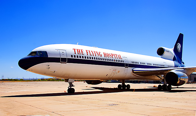
As bvoi has already suggested, the perspective is rather ordinary and uninspired. I must agree with both Earl and bvoi that the "No Borders" was not the best choice for a "saying." While I recognized it as a phrase, it just didn't seem to work as well here for this image as you intended.
I gave this a 5, and think that is fair. It's an OK shot of a plane that barely meets the challenge. Nothing super wrong here, but nothing super "wow" either.
In response to your forum post...
The first thing that hits my eye is the nice color saturation and the off-beat choice of subject. If I try to think like the average dpc voter, the first thing that needs improvement is the title. "No Borders" is not the most pithy of sayings. Next is the lighting. It is hard to pull-off a great outdoor shot in harsh light. There is definitely loss of detail in the shadows that you did a good job try to manage in post-proccessing. If you would have shot this 30 mins. before sunset, your score would have been at least .3 points higher in my opinion. Lastly, the image could benefit from a different vantage point to make it more dynamic and graphic. Perhaps if the camera was very close to the ground, the plane would look more powerful. Right now it is shot at the infamous 5'8" of death.
Anyway, don't be discouraged. Every shot that doesn't do as well as we hoped is an opportunity to learn. Shots that do well just puff ourselves up and offer little in terms of growth potential. They do feel good though. Keep shooting!
This comment is in response to your forum question.
I gave you a "4". When I first look at an image I ask (1) Did it meet the challenge? and (2) is it a good photo? A "decent" photo that meets the challenge is a "5" in my book. If the photo isn't even "decent" or if, in my view, it doesn't really meet the challenge, then I'll drop to a "4".
If the photo is better than decent in technical execution or in creativity, then it goes up from "5". A "good" or "plus" photo that meets the challenge is a six. Great photos go up from there. On the downside, I'll give a "3" to a really bad picture that is attempting to meet the challenge. Lower votes ("2" and "1") go to bad photos that I think are really making no effort at all and which seem, to me, to not be serious entries.
Your picture, to me, was a decent but uninspiring photo of an airplane sitting on the ground. Pretty static, and a little boring. A lot of blue sky and brown concrete. Harsh sunlight. So, to me, if it clearly met the challenge, I probably would have gone to a "5". But the "No Borders" caption was not, to me, a "well-known, often-heard phrase, proverb, cliché or saying." So I did not think that the photo met the challenge very well, which is why I moved down to a "4".
How does a picture of this plane go from "4" to "10"? How about a well-composed action photo of the plane landing in a third world country, with sick children waiting for the doctors to arrive? Or a shot of the doctors exiting the plane to tend to the waiting victims? A night shot of the plane in dramatic lighting would bump you up a couple of points. That's the type of thing that brings the photo to life.
I hope these comments help. I'm new here myself and I have learned an awful lot about my own photography in just a few weeks.
I gave it a 7. I just thought different perspective (closer to the left, and more of plane's tail and wings) could add to the picture. I realy liked the cliche and the whole idea (Doctors without borders). It definately doesn't deserve such a low score.