| Author | Thread |
|
|
05/16/2006 07:14:32 AM |
Hey there from the Critique Club
First off, always try to include some info about the shot in the Photographer's Comments section. It really helps out when we know what the photographer was thinking and what equipment/lighting/etc. were used, especially when you request a critique.
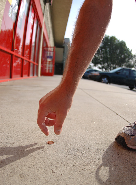
Camera Work/Technical: You achieved an excellent depth of field here, allowing the viewer to recognize the background, but allowing it to blur enough so its not a distraction. The direction of the reaching arm provides a strong guide that draws the viewer down onto the photograph and onto the penny. The moment is such that it provides a level of expectation that the fingers will close at any second.
Lighting: Excellent choice of positioning to capture this shot. Natural light is always my favorite for shooting, but often difficult to control during harsh times of day. You did a fantastic job with the harsh light to provide a nicely back lit subject with balancing shadows and terrific detail.
Composition/Content: Reading the earlier comments, I tend to disagree with the ones that see the background as too busy. I think that shooting at f/2.8 rendered it recognizable, but not distracting. I do have two small concerns with the composition. First, and the most distracting is that foot with its shadow on the right of the frame. It pulls attention away from your subject and provides a distraction that the eye returns to over and again. Also, but much, much smaller, is the very top, right-hand corner, where the knee crept into the frame. Again, distracting. A little cropping would have taken care of this one. Repositioning that foot and the camera would have helped the overall composition.
My Opinion: I like the concept, but would have liked to have seen a better execution. This would have pulled a 5 from me based on the distraction. It meets the challenge well, and you did a great job with difficult lighting, but that foot pulls you down. With a slightly different composition, I would have voted 6 or 7. Nice work, but there is always room for improvement. |
|
Comments Made During the Challenge  |
|
|
05/09/2006 02:20:39 PM |
| The exposure is good. Hard to take picture agains the sun. Good job and good luck. |
|
 Photographer found comment helpful. Photographer found comment helpful. |
|
|
05/09/2006 09:43:02 AM |
| See a pin and pick it up and all that day you'll have good luck. A penny for your thoughts. Not sure you have it right but even so 7. |
|
|
|
05/09/2006 06:05:32 AM |
|
| Photographer found comment helpful. |
|
|
05/08/2006 02:36:10 PM |
The red color cast doesn't work for me...
TC |
|
|
|
05/07/2006 10:56:18 PM |
|
| Photographer found comment helpful. |
|
|
05/06/2006 10:09:58 PM |
|
| Photographer found comment helpful. |
|
|
05/03/2006 07:55:29 PM |
| Never heard this cliche, but no big deal. The foot is distracting. |
|
|
|
05/03/2006 06:39:29 PM |
| Nice concept, however I think a different crop and a less distracting background would have worked better. Maybe take away the shoe on the right side. |
|
| Photographer found comment helpful. |
|
|
05/03/2006 06:28:32 PM |
| the crop on the arm is a little awkward...it would be better to cut it off either below or above the elbow - not right at it. |
|
|
|
05/03/2006 10:40:11 AM |
| The background is a real issue for me. There's just too much happening back there (i.e. lots of contrast and color) which pulls my eye to the center rather than the hand and the penny. Probably a better way to shoot this was to face the wall or something more uniform so that the hand and penny stand out more. |
|
|
|
05/02/2006 11:18:31 PM |
| Very interesting shot and great angle. Love the fish-eye effect as well and the shoe to break the long arm. Well done! |
|
| Photographer found comment helpful. |
Home -
Challenges -
Community -
League -
Photos -
Cameras -
Lenses -
Learn -
Help -
Terms of Use -
Privacy -
Top ^
DPChallenge, and website content and design, Copyright © 2001-2025 Challenging Technologies, LLC.
All digital photo copyrights belong to the photographers and may not be used without permission.
Current Server Time: 04/07/2025 01:50:00 PM EDT.