| Author | Thread |
|
|
05/16/2006 07:28:32 AM |
Hi from the Critique Club!
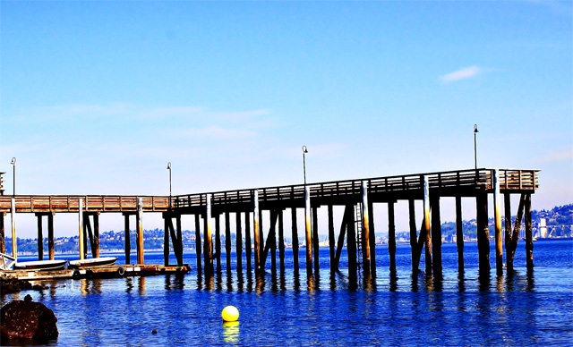
Sometimes when we look at a scene in real life we feel something, or it moves us. Often when we take a photograph of that moment, it can fail to convey or capture that feeling or emotion, no matter how accurate the exposure, depth of field or shutter speed. The camera cannot sense what we sense.
Sometimes, we find that by experimenting with photoshop we can create an image that whilst it isn't 'true to life' strictly speaking, it can convey something of what we saw with our 'other' vision.
I think that perhaps you have done that here; the over saturation does convey a sense of one of those days, when the blue of the sky, and it's reflection in the water are almost too blue and wonderful.It's all down to personal choice and taste and depends on who you are trying to please - yourself or others.
That said: The rhythm created by the pier is irregular but interesting, but the fact that it tilts upwards on the right-hand side distracts the eye of the viewer and disturbs the balance.
The yellow buoy is a nice contrast to the blue, but the boat? in the bottom left-hand corner is very distracting. Had you cropped the left hand side of the image to get rid of this, it would not have harmed your image much. In fact you could have cropped up to the clearer water reflections and made a cleaner image perhaps, focusing even more on the pier and the clean reflections on the water.
|
|
 Photographer found comment helpful. Photographer found comment helpful. |
Comments Made During the Challenge  |
|
|
05/08/2006 08:16:19 PM |
| I love saturation but you went a little over the top here. Looks more like a painting. More dock and less sky would have helped. The subject is the dock but it occupies precious little of the frame. - 5 |
|
| Photographer found comment helpful. |
|
|
05/05/2006 09:26:44 PM |
| Pity you didn't straighten your horizon, it's very tilted. |
|
| Photographer found comment helpful. |
|
|
05/05/2006 04:44:06 PM |
| Sorry but the blue is a distraction for me |
|
|
|
05/05/2006 01:26:39 AM |
| a little less saturation for the colours would have worked better as per my taste |
|
|
|
05/04/2006 07:22:00 AM |
|
| Photographer found comment helpful. |
|
|
05/03/2006 11:47:10 PM |
|
| Photographer found comment helpful. |
|
|
05/03/2006 09:03:40 PM |
|
|
|
05/03/2006 06:01:08 PM |
| It's a nice picture but I think that it would probally be better if you rotated it to the right a little so the pier was even. |
|
| Photographer found comment helpful. |
|
|
05/03/2006 05:42:29 PM |
|
|
|
05/03/2006 05:23:07 PM |
| Perhaps another angle would have focused the eye more on the repeating lines, or less sky. |
|
|
|
05/03/2006 04:02:21 PM |
| Way too much blue in the post-processing. |
|
|
|
05/03/2006 08:51:55 AM |
| The water looks over saturated. |
|
|
|
05/03/2006 05:32:32 AM |
| The blue is a bit intense and does not make up for the lack of overt rhythm. |
|
|
|
05/03/2006 02:16:53 AM |
|
|
|
05/02/2006 09:04:37 PM |
| Nice setting. Maybe you punched up the blue a tad too much? |
|
Home -
Challenges -
Community -
League -
Photos -
Cameras -
Lenses -
Learn -
Help -
Terms of Use -
Privacy -
Top ^
DPChallenge, and website content and design, Copyright © 2001-2025 Challenging Technologies, LLC.
All digital photo copyrights belong to the photographers and may not be used without permission.
Current Server Time: 04/07/2025 01:25:56 PM EDT.