| Author | Thread |
|
|
05/18/2006 03:14:54 AM |
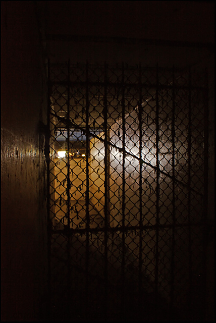
[[trading post]]
there´s nothing much I can say about this image, the score tells the story..
there is nothing in this image exept for a fence, and that is not interesting.
I like the lighting though to bad you can see the light source. |
|
 Photographer found comment helpful. Photographer found comment helpful. |
|
|
05/10/2006 04:30:53 AM |
[[Trading Post]]
Sorry I hadn't gotten around to commenting on this one yet! I really like the lighting. There may be other better ways to do it, but this screams "prison" to me. Some of the stuff in the background is a little confusing, though, and I spend too much time trying to decipher what it is. Probably would have given this a 5 or 6.
EDIT - for a PJ shot, this IS a bit too dark, IMHO.
Message edited by author 2006-05-10 08:31:40. |
|
| Photographer found comment helpful. |
|
|
05/09/2006 06:35:33 PM |
hello again.
while i liked the mystery surrounding the title, i felt the image was a bit too dark.
the iron gate is nice leading into the hallway, but i did not feel it was the "big story". the bigger story would have been the cache in the prison, not the gate. unless of course the gate is supposed to be the cell. but i did not feel like i was in a cell, but an apartment complex. ifn you had some sort of bed on the other side to signify more of a prison type feel that would have been better. a steel plate and cup. something to make me feel like the darkness is "dark".
which led me to only looking at the picture for some sort of salvage. i thought the picture stand alone (without title) was like one of my images.... mediocre at best. |
|
| Photographer found comment helpful. |
|
|
05/09/2006 07:09:20 AM |
trading post
Hmmm...
I think you've got the exposure perfect as an image, but maybe this darkness would not be appropriate for a newspaper. I like how the eye is led in with the perspective and lighting.
Focus seems a little soft, but not too noticeable.
The dirtyness of the fencing suits the mood.
I think if you cropped off a tiny bit of the left hand side, the composition could be stronger .
woah, I didn't look at the score on this - WAY underrated, guess its very susceptible to monitor differences. I would have expected a 5.4 - technically good, nice originality, but not wow or front-page material. Definitely should have done better than mine :P |
|
| Photographer found comment helpful. |
|
|
05/08/2006 06:38:19 PM |
| Slightly underexposed and soft, though the central light leads the eye through the image in a satisfying way. It's probably a bit too underexposed, however. If this were corrected, and the fence links were razor sharp, and you had decided on b/w to enhance the WWII theme, it may have done better. |
|
| Photographer found comment helpful. |
|
|
05/08/2006 05:00:22 PM |
Trading Post comment
The thing I like alot about this picture is the perspective and the angles created. It's still a bit too dark for my taste, though it does invite the viewer to look more carefully to see what's there. As I said during voting, I do think this would be a good picture to accompany a magazine article but with a bit more light to pull out the texture and detail of the walls. |
|
| Photographer found comment helpful. |
|
|
05/08/2006 07:58:35 AM |
Trading Post -
Right off the bat - way too much shadow for me and not enough detail. The light in the back, while it does shine on the wall, just seems so bright that that is where my eyes go to and it just doesnt offer anything but being a bright spot. I gave this a 4 overall. I understand the idea and felt it made the challenge description, but technically it is too dark for me without enough detailed highlights. And from that the interest/appeal level was diminished. |
|
| Photographer found comment helpful. |
|
|
05/08/2006 05:37:27 AM |
Trading Post...
I thought this was a great idea. It just didn't seem to be executed real well. During voting I gave this a 5 because though it does seem like it could be an old prison, it seems more like a gated alley with a street light in the background. The darkness and lack of a subject failed to hold my interest. |
|
| Photographer found comment helpful. |
|
|
05/07/2006 09:36:41 PM |
--Trading Post Comment--
No way this is a sub-5 shot. I think that too many voters got too carried away with the challenge title this time. Some concentrated on the title, while others worried about how it would look in news print. This is a very nice shot, and I think that the title really adds to it. The composition is excellent, with the light at the end of the tunnel really pulls the viewer into the frame. The cage makes me want to look deeper and see what else is back there. I think that I might have tried to darken the left wall a bit, but that would have been about it. Nice work, and an easy 6+ capture. |
|
| Photographer found comment helpful. |
Comments Made During the Challenge  |
|
|
05/07/2006 03:24:20 PM |
|
| Photographer found comment helpful. |
|
|
05/06/2006 04:00:42 AM |
| Good idea and I like the photo overall but if this were to be used in newsprint I believe it would come out way to dark to really tell anything about it - for image composition, it's good, but for the challenge I'm not sure it works. |
|
| Photographer found comment helpful. |
|
|
05/05/2006 05:10:39 PM |
| Probably a bit too dark for a newspaper submission but could work in a feature article in a magazine. |
|
| Photographer found comment helpful. |
|
|
05/03/2006 08:21:25 PM |
| Front page news, good job |
|
| Photographer found comment helpful. |
|
|
05/03/2006 05:43:15 AM |
| A little more light maybe, it is hard to make out what is there. |
|
| Photographer found comment helpful. |
|
|
05/03/2006 03:21:24 AM |
is this rally a prison ? i don't think so :-)
about the photo: not bad, reflection is okay and fence silhouette is okay |
|
| Photographer found comment helpful. |
|
|
05/02/2006 03:32:35 PM |
| Hard to see whether this would come through well enough defined on newsprint. But it certainly does make a viewer want to read more about the discovery. |
|
| Photographer found comment helpful. |
|
|
05/01/2006 08:47:05 PM |
| A little too dark for my taste |
|
| Photographer found comment helpful. |
|
|
05/01/2006 12:09:03 PM |
| I'm gonna take you on your word that it was just recently discovered. The shot is a bit dark to work well in print and the lighting sort of tells me that it's not a fresh discovery. |
|
| Photographer found comment helpful. |
Home -
Challenges -
Community -
League -
Photos -
Cameras -
Lenses -
Learn -
Help -
Terms of Use -
Privacy -
Top ^
DPChallenge, and website content and design, Copyright © 2001-2025 Challenging Technologies, LLC.
All digital photo copyrights belong to the photographers and may not be used without permission.
Current Server Time: 04/07/2025 01:30:06 PM EDT.