| Author | Thread |
|
|
05/06/2006 09:31:30 PM |
*Critique Club*
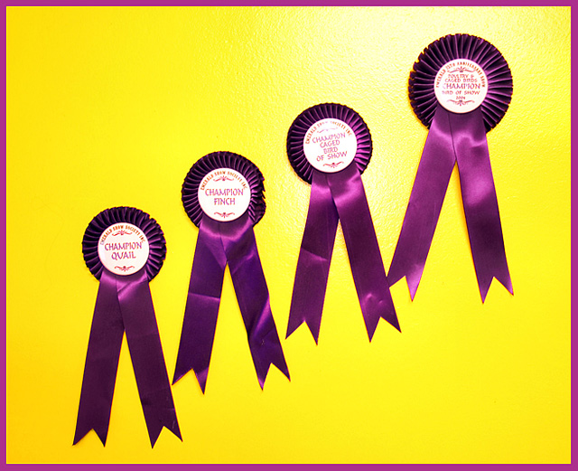
"Steps to championship" is a very good entry into the Complementary Colors challenge. I remember your shot during the voting because I spent some time reading the ribbons.
The over image is a very nice entry. Great choice of the yellow and purple for contrast, I also like your idea of having the ribbons climb it really ties well into the title. I would try to map out your ribbon placement so they are spaced out a little more evenly because you might have filled the space a little more, especially on the lower left hand side. Also I might try other lighting to balance out the shot. The flash is just a little too strong for the shot and takes away and created that funky hazy/shadow on the winning ribbon. Overall good idea. Also good idea to use the border to tie the shot all together.
You defiantly have the ideas and the skills so I always look forward to your entries, keep up the good work. |
|
 Photographer found comment helpful. Photographer found comment helpful. |
Comments Made During the Challenge  |
|
|
04/30/2006 12:53:42 PM |
|
| Photographer found comment helpful. |
|
|
04/30/2006 12:52:45 PM |
| intersting shot, just seems a bit flat |
|
| Photographer found comment helpful. |
|
|
04/30/2006 11:36:48 AM |
| I would try to resist using direct flash whenever possible. It makes it much brighter in certain spots then others |
|
| Photographer found comment helpful. |
|
|
04/30/2006 05:40:19 AM |
| fits teh challenge. nice texture. the border is distracting. 7 |
|
| Photographer found comment helpful. |
|
|
04/29/2006 07:55:24 PM |
|
| Photographer found comment helpful. |
|
|
04/29/2006 06:56:54 PM |
| Light seems a little hard, but a very nice composition. |
|
| Photographer found comment helpful. |
|
|
04/29/2006 11:08:35 AM |
| lovely use of complimentary colors here. wow you must have great entries to have scored this many ribbons ;) good luck! |
|
| Photographer found comment helpful. |
|
|
04/28/2006 05:53:47 PM |
| I like this idea, and the colors blend well, as well as the matching border. I found myself squinting to read the ribbons tho. |
|
| Photographer found comment helpful. |
|
|
04/27/2006 12:40:56 PM |
| I think you had a decent concept here. The reflections on the ribbons, especially on the wording in the 3rd one, take away. If they were all perfectly straight, it would have helped as well. 6 |
|
| Photographer found comment helpful. |
|
|
04/27/2006 07:47:38 AM |
| Nice concept. Sharp contrast and focus. It looks as if the flash bleached out a little yellow in the upper right but otherwise, this is a great shot. |
|
| Photographer found comment helpful. |
|
|
04/26/2006 07:09:29 PM |
|
| Photographer found comment helpful. |
|
|
04/26/2006 02:06:46 PM |
| 4 - Like the colors. Better 'symmetry' and balance, 'ironing' of the ribbons, would have made this better in my opinion. Harder to read the third 'label', perhaps because of harsh lighting/flash. Ultimately, unless you do something really unusual with this, in my opinion, this shot is going to be a colorful shot of four bird show ribbons... which for the viewer does not mean the same as likely does for you. |
|
| Photographer found comment helpful. |
|
|
04/26/2006 11:03:58 AM |
| lighting along the top ribbon is a bit harsh |
|
| Photographer found comment helpful. |
|
|
04/26/2006 03:28:51 AM |
| Champion Image? A little light in the yellow area, but still I like the colors and comp in this one! 8 |
|
| Photographer found comment helpful. |
|
|
04/26/2006 02:40:15 AM |
| congratulations on the ribbons...to be nit picky, the creases in them distract me...the flash is also quite harsh |
|
| Photographer found comment helpful. |
Home -
Challenges -
Community -
League -
Photos -
Cameras -
Lenses -
Learn -
Help -
Terms of Use -
Privacy -
Top ^
DPChallenge, and website content and design, Copyright © 2001-2025 Challenging Technologies, LLC.
All digital photo copyrights belong to the photographers and may not be used without permission.
Current Server Time: 04/07/2025 01:20:53 AM EDT.