| Author | Thread |
Comments Made During the Challenge  |
|
|
08/17/2003 02:43:10 PM |
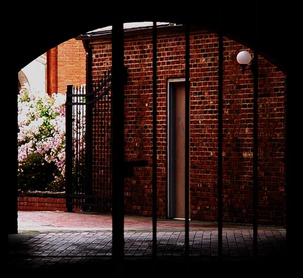
| Very nice use of the silhouette to frame the picture, and meet the challenge at the same time. |
|
|
|
08/17/2003 05:05:59 AM |
| Very dark picture. May have looked better in b/w or a duotone because of the mood here. I like the spark of color on the left, but wish it was just a little more central to the composition. 6 |
|
|
|
08/13/2003 09:27:55 AM |
| The metering in this photo was challenging I'm sure. The dark bricks on the right with the sunlit bush on the left probably overwhelmed the camera. I wonder how this shot would have come out if somoene were standing out of view to the left with a large piece of white posterboard or something to reflect some light back into the bricks. The bars in the FG are already black but I'm thinking that will a little side light flowing into the bricks you could have stepped the lens down a little and gotten more definition on the bush and blossoms without losing any of the brickwork. 7 |
|
|
|
08/12/2003 02:46:26 PM |
| Pleasing colors and composition. Yes, a fill flash would have been nice, and the light on the flowers is too much on top. This photo gets a high mark from me. |
|
|
|
08/12/2003 09:19:24 AM |
| great area, however maybe a little dark |
|
|
|
08/11/2003 07:48:43 AM |
| I like the framing concept here - the shape of the gate opening is appealing. However, IMHO, the view through is less appealing though and somewhat dark. |
|
|
|
08/11/2003 04:41:21 AM |
| For me this is too dark around the perimeter and loses the textured feeling of the bricks on the wall and on the ground |
|
Home -
Challenges -
Community -
League -
Photos -
Cameras -
Lenses -
Learn -
Help -
Terms of Use -
Privacy -
Top ^
DPChallenge, and website content and design, Copyright © 2001-2025 Challenging Technologies, LLC.
All digital photo copyrights belong to the photographers and may not be used without permission.
Current Server Time: 04/07/2025 01:04:32 PM EDT.