| Author | Thread |
Comments Made During the Challenge  |
|
|
05/02/2006 05:33:07 PM |
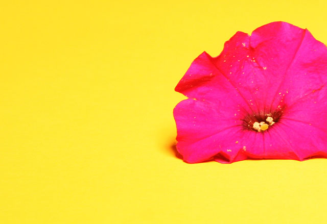
| Purple and yellow are complenentary colors. I think different lighting would have helped bring out the detail in the petals. |
|
 Photographer found comment helpful. Photographer found comment helpful. |
|
|
05/02/2006 02:52:22 AM |
| Background is too bright, it detracts from the flower. |
|
| Photographer found comment helpful. |
|
|
05/01/2006 03:31:33 PM |
| Color of flower is very uneven. Probably you added too much contrast or saturation. |
|
| Photographer found comment helpful. |
|
|
04/30/2006 12:37:36 PM |
|
| Photographer found comment helpful. |
|
|
04/30/2006 11:29:41 AM |
| Colors look too washed out, which is affecting the details of the flower. |
|
| Photographer found comment helpful. |
|
|
04/30/2006 07:22:08 AM |
|
| Photographer found comment helpful. |
|
|
04/30/2006 04:34:29 AM |
| doesnt fit the challenge. |
|
| Photographer found comment helpful. |
|
|
04/29/2006 06:10:27 PM |
| good shot but no complementary color |
|
| Photographer found comment helpful. |
|
|
04/29/2006 03:49:50 AM |
| I think this is a very nice photo :) |
|
| Photographer found comment helpful. |
|
|
04/28/2006 10:23:44 PM |
| It's either my monitor is off or these are not complimentary colors. Yellow has violet and this one is red. |
|
| Photographer found comment helpful. |
|
|
04/28/2006 09:52:15 PM |
| really like the colors, but the pollen on the petals is sort of distracting |
|
| Photographer found comment helpful. |
|
|
04/28/2006 03:45:59 PM |
| I'm guessing that many have commented that this shot has missed the complementary colour based on colour theory. On my calibrated screen I see yellow and pink. Perhaps the processing changed the flower from purple to pink? JMO |
|
| Photographer found comment helpful. |
|
|
04/27/2006 05:57:33 PM |
|
|
|
04/27/2006 02:44:06 PM |
Funny colours. Looks like wet paint.
Good clean picture! |
|
| Photographer found comment helpful. |
|
|
04/27/2006 12:34:27 PM |
|
|
|
04/27/2006 04:03:45 AM |
| its suppose to be purple and yelow not pink |
|
| Photographer found comment helpful. |
|
|
04/27/2006 12:49:21 AM |
| too satured in my opinion |
|
| Photographer found comment helpful. |
|
|
04/26/2006 07:57:39 PM |
| 2 - I'm seeing hot pink and yellow here, with beginnings of red. A hue adjustment (although realize that is likely what you've done, especially by the look of the yellow stigma), may have helped this. Color/contrast of the flower just too harsh in my opinion. Variation in composition/crop as well, not sure. Too much detail in the flower is lost, again my opinion. Realize this may all have been intentional though. |
|
| Photographer found comment helpful. |
|
|
04/26/2006 07:16:15 PM |
|
| Photographer found comment helpful. |
|
|
04/26/2006 04:06:27 PM |
| Oversaturated -- all detail of the petals have been lost. |
|
| Photographer found comment helpful. |
|
|
04/26/2006 03:25:34 PM |
| Yellow and purple are complementary colours, not yellow and pink. Focus seems a bit soft on the flower. |
|
| Photographer found comment helpful. |
|
|
04/26/2006 02:31:58 PM |
| This is a bit over-saturated for my taste. |
|
| Photographer found comment helpful. |
|
|
04/26/2006 02:00:07 PM |
| Looks pink and yellow here and maybe a bit oversaturated? Interesting composition, though. |
|
| Photographer found comment helpful. |
|
|
04/26/2006 02:11:55 AM |
| great colours...would have liked the bottom petals to be open and not tucked underneat |
|
| Photographer found comment helpful. |
Home -
Challenges -
Community -
League -
Photos -
Cameras -
Lenses -
Learn -
Help -
Terms of Use -
Privacy -
Top ^
DPChallenge, and website content and design, Copyright © 2001-2025 Challenging Technologies, LLC.
All digital photo copyrights belong to the photographers and may not be used without permission.
Current Server Time: 04/07/2025 01:26:01 PM EDT.