| Author | Thread |
|
|
05/23/2006 07:23:53 PM |
| Thanks for all of your comments! I hope to break five in my next challenge. |
|
|
|
05/08/2006 03:53:57 PM |
Hey there from the Critique Club
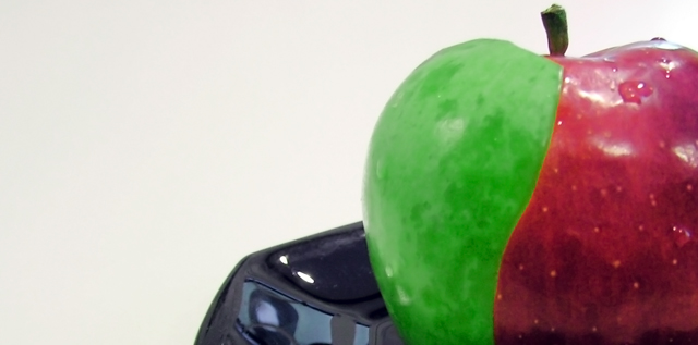
This is one of the most creative captures of the challenge. You did a very nice job presenting the appearance that the apples are indeed joined. I know that you've heard some of it already, but I going to echo your past comments a bit. The black dish is horribly distracting. With it simply sitting there, it probably took away a full point for most of the voters, maybe even more. Perhaps it was a shot at your last Complementary Colors challenge, including the black dish on the white background. It also looks like your camera chose the dish for the main point of focus for the image, thus leaving the apple just a touch out of focus. With the aperture set at 2.8, your depth of field is left very shallow. Judging from that and the 1/50 sec shutter speed, I assume that you were trying to compensate for low light. May try it again outside, or in a brighter room. I like the wide, rectangular composition that you created, and the colors complement each other nicely. I would have liked it a bit better if the green skin had gone up to the stem, but that wouldn't cost you any points in my voting. I think you had an excellent idea that didn't reach its full potential. The creativity is well above average, but the execution falls a bit below. As is, I'd rank it in the 3-4 range. Removing the dish and improving the focus would easily put in in the 6-7 range, in my opinion. |
|
 Photographer found comment helpful. Photographer found comment helpful. |
|
|
05/04/2006 09:04:49 AM |
I am colourblind (red/green) but still I can see that this is red and green. Arent they complimentary colours?
Originally posted by sammigurl:
None of those are complimentary colors. |
|
|
| Photographer found comment helpful. |
Comments Made During the Challenge  |
|
|
05/02/2006 11:30:27 PM |
| I like the creativity! I am not sure what the black thing is, but IMO it takes away from the photo. |
|
| Photographer found comment helpful. |
|
|
05/02/2006 09:49:37 PM |
Hey, I just wanted to say that this photo would've been awesome w/out the plate....
cool though!!
P.S.-Phoenix says hi (or meow...?!) |
|
| Photographer found comment helpful. |
|
|
05/02/2006 03:43:02 PM |
| What is the black part at the bottom and why all the empty white space? |
|
| Photographer found comment helpful. |
|
|
05/02/2006 03:38:21 AM |
| What a good idea - but what is the black thing? I wish you'd just kept the two tone apple as your subject. |
|
| Photographer found comment helpful. |
|
|
04/30/2006 08:10:19 PM |
| why didn't you have the green skin go all the way up? the black thing is distracting |
|
| Photographer found comment helpful. |
|
|
04/30/2006 07:39:44 PM |
| None of those are complimentary colors. |
|
|
|
04/30/2006 04:41:39 PM |
| interesting take on this challenge, the black item takes away from the photo |
|
| Photographer found comment helpful. |
|
|
04/30/2006 12:39:40 PM |
| Clever idea, but could be a little sharper. Not sure what the grey thing is, but it draws the eye away from the point of the composition. |
|
| Photographer found comment helpful. |
|
|
04/30/2006 09:58:49 AM |
| Nice idea, but I feel the composition is a bit unbalanced, and the focus seems off. |
|
| Photographer found comment helpful. |
|
|
04/30/2006 09:56:07 AM |
doesnt strike me
title doenst add much but fits the challenge/ wat is that dark thing on the bottom? |
|
| Photographer found comment helpful. |
|
|
04/30/2006 09:13:21 AM |
| Nice work putting this togethere. I love the concept. |
|
| Photographer found comment helpful. |
|
|
04/29/2006 09:01:16 PM |
| Maybe too much dead space. |
|
| Photographer found comment helpful. |
|
|
04/29/2006 08:32:51 PM |
| It's hard to tell what's going on here. |
|
| Photographer found comment helpful. |
|
|
04/29/2006 03:40:38 PM |
| Nice creative idea. I like it. |
|
| Photographer found comment helpful. |
|
|
04/29/2006 02:54:26 PM |
| nice. this must have taken a bit of work to create. for that setup, you get a good score ;) |
|
| Photographer found comment helpful. |
|
|
04/29/2006 01:04:03 PM |
| okay not baddly done at all -6 |
|
| Photographer found comment helpful. |
|
|
04/29/2006 08:22:55 AM |
| I find the black thing distracting and there is alot of glares on the apple |
|
| Photographer found comment helpful. |
|
|
04/29/2006 05:38:19 AM |
how was this done??
peeled off from a green apple?
hhmmm...
maybe a little more focus?
(^o^) |
|
| Photographer found comment helpful. |
|
|
04/29/2006 03:40:52 AM |
| I like the idea with the apples, but it took me quite some time to understand that this blue thing is probably simply a plate. |
|
| Photographer found comment helpful. |
|
|
04/27/2006 08:59:06 PM |
| 2 - Not sure what you've done here but don't think the 'vision' has been achieved. No idea what the black thing is, but detracts, in my opinion. |
|
| Photographer found comment helpful. |
|
|
04/27/2006 08:42:23 PM |
| Nice apple, the bowl is distracting. |
|
| Photographer found comment helpful. |
|
|
04/27/2006 01:34:38 PM |
| what is that black thing ? very disturbing. |
|
| Photographer found comment helpful. |
|
|
04/27/2006 11:37:35 AM |
| did u use photo editing cause im not buyin it. especially here. ^ |
|
| Photographer found comment helpful. |
|
|
04/27/2006 10:26:12 AM |
| Would have loved a better focus on this one. Nice idea |
|
| Photographer found comment helpful. |
|
|
04/27/2006 05:24:26 AM |
| unsharp, overprocessed, uninspured composition (too much white/grey space) and crop (panorama? what for?). and what's that stuff behind the apple? |
|
| Photographer found comment helpful. |
|
|
04/26/2006 11:28:01 PM |
|
| Photographer found comment helpful. |
|
|
04/26/2006 02:52:29 PM |
| aarggh, GM horrors . . .too much dead space |
|
| Photographer found comment helpful. |
|
|
04/26/2006 08:43:41 AM |
| ooo.. i whish you had skiped the plate.. just have the apple :( oh this coulde have been so nice.. very good idea 6 |
|
| Photographer found comment helpful. |
|
|
04/26/2006 08:19:01 AM |
| A very cool idea and the seam on the apple is very good. I really find the black object to be very distracting ... it was the first thing I noticed in the photo and my eye keeps being drawn to it. |
|
| Photographer found comment helpful. |
|
|
04/26/2006 05:11:08 AM |
| it's really blurry...sorry |
|
|
|
04/26/2006 04:32:47 AM |
| Good idea! Could be sharper, and I feel the plate is a little distracting to me. Either see most or all of the plate, or leave it out. I definately feel like I want to see more of the apple. |
|
| Photographer found comment helpful. |
Home -
Challenges -
Community -
League -
Photos -
Cameras -
Lenses -
Learn -
Help -
Terms of Use -
Privacy -
Top ^
DPChallenge, and website content and design, Copyright © 2001-2026 Challenging Technologies, LLC.
All digital photo copyrights belong to the photographers and may not be used without permission.
Current Server Time: 02/01/2026 11:23:24 AM EST.