| Author | Thread |
Comments Made During the Challenge  |
|
|
05/02/2006 11:06:08 PM |
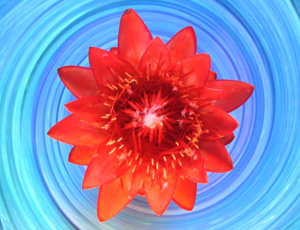
| I like the colors and composition, but the flower looks a little out of focus. |
|
|
|
05/02/2006 06:50:22 AM |
| Very imaginative composition, but I'd like to see more detail in the flower. |
|
 Photographer found comment helpful. Photographer found comment helpful. |
|
|
04/30/2006 02:59:35 PM |
| This is a fantastic shot but its using the wrong compliments. Still a powerfull combination of colors though. 7 |
|
| Photographer found comment helpful. |
|
|
04/30/2006 12:46:19 PM |
| Interesting composition but the image appears out of focus. |
|
| Photographer found comment helpful. |
|
|
04/30/2006 11:36:27 AM |
| a bit pushing on the red for it to be orange but i liek the setup focus and lighting and the title does add to the photo. 9. |
|
| Photographer found comment helpful. |
|
|
04/30/2006 11:09:26 AM |
| neat idea. the red/orange seems a little faded. |
|
| Photographer found comment helpful. |
|
|
04/29/2006 11:17:52 PM |
| nice job i like the backround alot |
|
| Photographer found comment helpful. |
|
|
04/29/2006 11:08:54 PM |
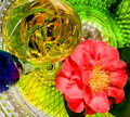
| Great title, love the effect the bowl gives this photo...looks like a time warp or something. Great complementary colours used here, well done and good luck with this entry. |
|
| Photographer found comment helpful. |
|
|
04/29/2006 04:40:31 AM |
|
| Photographer found comment helpful. |
|
|
04/27/2006 08:52:28 PM |
| Is the flower supposed to be orange or red? Is the background supposed to be green or blue? I honestly can't tell if it's complementary or not. |
|
|
|
04/27/2006 04:34:24 PM |
|
| Photographer found comment helpful. |
|
|
04/27/2006 11:36:30 AM |
|
| Photographer found comment helpful. |
|
|
04/27/2006 11:29:37 AM |
|
| Photographer found comment helpful. |
|
|
04/26/2006 08:16:57 PM |
| 4 - Like the concept and angle. Coming across more red than orange, but is bordering, so who knows. More definition 'somewhere' in the flower/sharper, and better control of the reds/oranges, make this better in my opinion. |
|
| Photographer found comment helpful. |
|
|
04/26/2006 06:53:39 PM |
| Like the sense of motion in the blue |
|
| Photographer found comment helpful. |
|
|
04/26/2006 07:01:05 AM |
|
| Photographer found comment helpful. |
Home -
Challenges -
Community -
League -
Photos -
Cameras -
Lenses -
Learn -
Help -
Terms of Use -
Privacy -
Top ^
DPChallenge, and website content and design, Copyright © 2001-2026 Challenging Technologies, LLC.
All digital photo copyrights belong to the photographers and may not be used without permission.
Current Server Time: 02/01/2026 08:57:16 AM EST.