| Author | Thread |
|
|
05/06/2006 06:24:23 PM |
::: Critique Club :::
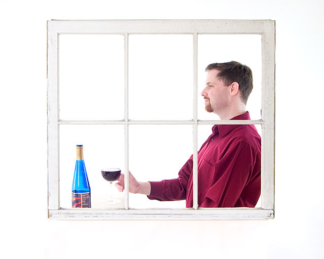
Hi, my name is Kari and from the critique club.
I hate getting the site council pics .. but here ya go :)
First Impression - the most important one:
Love the concept .. looks a little unnatural/uncomfortable.
Composition:
This is nicely done, the use of the different panes is ok ... but could have been played further by having the hand fully in the first bottom pane. The model (I know its you) looks uncomfortable ... don't know why as you have photographed yourself before ... oh well.
Subject:
Meets the challenge.. and how does it ... just hang the window from the ceiling .. this is a unique take on the challenge .. at least you got no reflection.
Technical (Colour and light):
Love the colours ... black and white I think may have been overkill ... the strong colours against the white really do work.
To grow its vote?:
Couple of things .. think of yourself as a model when you are ... and what the photographer would say ... loosen up .. relax ... also try several different crops .. this may have worked better using the actual frame as the crop ...
Summary:
I think this is a good shot .. this is also out of the box .. so keep thinking that way.
If you've got any questions about this critique, please feel free to contact me via the PM system.
Cheers
Kari
Message edited by author 2006-05-06 22:25:58. |
|
 Photographer found comment helpful. Photographer found comment helpful. |
|
|
05/01/2006 10:08:29 AM |
This is an interesting idea. Lots of possiblities as to what is framed by the window. Funny, when I first saw the thumbnail I thought it was a gun being pointed at the bottle?
Message edited by author 2006-05-01 19:23:59. |
|
| Photographer found comment helpful. |
Comments Made During the Challenge  |
|
|
04/30/2006 05:35:45 PM |
| Not really digging the WHITE in this image, that and the guy looks uncomfortable and very set up. Like the lighting on him though. |
|
| Photographer found comment helpful. |
|
|
04/30/2006 04:47:23 PM |
| eh... wish the whte wasnt blown out... |
|
| Photographer found comment helpful. |
|
|
04/30/2006 01:34:00 PM |
|
| Photographer found comment helpful. |
|
|
04/30/2006 01:16:20 PM |
| Nicely executed lighting. |
|
| Photographer found comment helpful. |
|
|
04/30/2006 06:28:43 AM |
| MMmm I don't like the wide white frame. Nice shot though |
|
| Photographer found comment helpful. |
|
|
04/29/2006 05:28:15 PM |
| This is a nice effort, but I think the white background is a little too washed out. Makes it hard to see the details such as the stem on the glass. Over all, though, it shows some thought and expression. It is especially good if you are both the photographer and the model. |
|
| Photographer found comment helpful. |
|
|
04/29/2006 05:08:32 PM |
| I like all of the white. Nice picture |
|
| Photographer found comment helpful. |
|
|
04/29/2006 11:52:34 AM |
| Nice high key shot. The guy is a bit stiff, but still, nice lighting. |
|
| Photographer found comment helpful. |
|
|
04/29/2006 07:34:36 AM |
| Seems slightly over-exposed, no detail around the glass. Nice shot tho, nice and clean. |
|
| Photographer found comment helpful. |
|
|
04/29/2006 07:25:28 AM |
| lol, great high key photo. |
|
| Photographer found comment helpful. |
|
|
04/28/2006 06:05:05 PM |
| his hand looks awkward... image might be more effective in b&w |
|
| Photographer found comment helpful. |
|
|
04/28/2006 01:31:08 PM |
| c'est la vie. Tres bien idea, well executed, but missing some "spice" to make it memorable. |
|
| Photographer found comment helpful. |
|
|
04/28/2006 01:02:32 PM |
Nooooo... could this possibly be... the one... the only... clubjuggle? LOL!!!
If not, you have my appologies. If so, then I still think it is a terrific photograph despite the distracting human figure in the composition. ;) Great technicals on this one. Interesting use of white space, excellant color and sharpness. |
|
| Photographer found comment helpful. |
|
|
04/27/2006 03:12:27 AM |
| clever...this is good...lacks a little pizazz, a little flat, but great work |
|
| Photographer found comment helpful. |
|
|
04/26/2006 11:47:07 AM |
| A bit too light.. doesn't immediately come to me like he's a Frenchman ;-) Like the idea though! |
|
| Photographer found comment helpful. |
|
|
04/25/2006 05:12:15 PM |
Nice job with the lighting although the rim of the glass has disappeard on my monitor. Nice color choice on the shirt.
I dont profess to be expert on photographing wine, but a helpful tip was given to me which said to heavily dilute the wine with water to allow some light to pass. but who wants to spoil good wine? :) |
|
| Photographer found comment helpful. |
|
|
04/25/2006 09:44:45 AM |
| Nice set up, wish the outside wall had some colour other than white, it might make the photo pop a little more. Still a good job. |
|
| Photographer found comment helpful. |
|
|
04/24/2006 07:53:49 PM |
|
| Photographer found comment helpful. |
|
|
04/24/2006 07:31:03 PM |
| Simplicity, at its best..... |
|
| Photographer found comment helpful. |
|
|
04/24/2006 08:27:40 AM |
| I really like the high key thing you have going on here. Nice. |
|
| Photographer found comment helpful. |
|
|
04/24/2006 12:52:13 AM |
|
| Photographer found comment helpful. |
Home -
Challenges -
Community -
League -
Photos -
Cameras -
Lenses -
Learn -
Help -
Terms of Use -
Privacy -
Top ^
DPChallenge, and website content and design, Copyright © 2001-2025 Challenging Technologies, LLC.
All digital photo copyrights belong to the photographers and may not be used without permission.
Current Server Time: 04/07/2025 02:01:41 PM EDT.