| Author | Thread |
|
|
05/03/2006 08:36:42 PM |
*Critique Club*
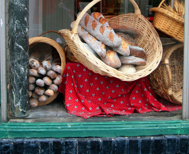
"Five Loaves Bakery" is a nice entry into the Window Framed challenge.
The image itself has a different subject which I think grabs attention. I really like your idea and think you have a great idea. The contrast between the green and the red also grabs attention and enhances the shot. Unfortunately the reflections that we can see in the glass take away from the overall image. Also I might have tried cropping it a little differently. I would have tried it tighter on the right side like on half way on the column. Also possibly cropped the pole on the left side out completely because it is distracting because of how uneven it looks.
Overall this was a great idea and I look forward to your future works! |
|
 Photographer found comment helpful. Photographer found comment helpful. |
Comments Made During the Challenge  |
|
|
04/30/2006 04:41:43 PM |
| 5 loaves, theres like 20 loaves there!! :) |
|
| Photographer found comment helpful. |
|
|
04/30/2006 03:13:49 PM |
| A bit like a snapshot, your reflection in the window really takes away from this shot. Some nice colours and textures though. |
|
| Photographer found comment helpful. |
|
|
04/30/2006 10:42:46 AM |
| I like the idea ,but the crop is very tight and may be more of the window wold of done well in this image ,the other thing is i can see your reflection in the window :) |
|
| Photographer found comment helpful. |
|
|
04/30/2006 08:55:39 AM |
| Well seen and executed, great complimentary colors in the shot... not too cluttered, only one theme of interest, well done! |
|
| Photographer found comment helpful. |
|
|
04/30/2006 08:34:59 AM |
| A few things you could do to improve your image, one cropping in from the sides removing the silver frames, two adding more contrast, three blurring background object. I used the elliptical marquee tool, by pulling out a nice big circle then inversing it. Then I filled with black paint and blurred it to remove the sharp circle edge. Then you drop the opacity down to about 10%. Give you a better image. Also this helps the viewer focus on the subject. |
|
| Photographer found comment helpful. |
|
|
04/30/2006 07:09:15 AM |
| Somehow this doesn´t seem as sharp as it could be other than that, very mediocre, I mean, it´s just a shop window and compared to the effort many others put into this challenge, this pales in comparison... 4 from me. |
|
|
|
04/30/2006 04:47:33 AM |
| Excellent shot.I love the colors. It is 10 from me. |
|
| Photographer found comment helpful. |
|
|
04/29/2006 07:03:15 PM |
This is a photo of a window with bread in it...
It doesn't really tell a story like it probably could...compositionally, you should think about drawing the viewer into the frame, leading their eye where it should go, and giving it something to rest on.
A polarizer could help to minimize your reflection that you got of yourself. |
|
| Photographer found comment helpful. |
|
|
04/29/2006 03:20:16 PM |
| nice shot. Did you mean to have the reflection? |
|
| Photographer found comment helpful. |
|
|
04/29/2006 12:13:21 PM |
| Pretty colors. Next time, shoot from a slight angle so you dont' end up as a reflection in the window. |
|
| Photographer found comment helpful. |
|
|
04/29/2006 09:57:45 AM |
| i would have cropped tighter on the edges for this shot |
|
| Photographer found comment helpful. |
|
|
04/29/2006 09:32:09 AM |
| Very nice. I might have composed just a bit differently to include the rest of the basket handle, but that would be about the only change that I'd make. Great colors and crisp focus. |
|
| Photographer found comment helpful. |
|
|
04/28/2006 12:59:01 PM |
|
| Photographer found comment helpful. |
|
|
04/27/2006 06:26:28 AM |
| I like it a lot and would have rated it higher but it seems a bit out of focus. (Although perhaps this was the desired effect.) Good luck. |
|
| Photographer found comment helpful. |
|
|
04/25/2006 04:40:51 PM |
| The slightly out of level sill bothers me a little. But, nice color combination and exposure. |
|
|
|
04/25/2006 09:48:52 AM |
| Very nice, great colours and textures. |
|
| Photographer found comment helpful. |
|
|
04/25/2006 08:27:19 AM |
| Nice colors and composition. Could you have zoomed back just a bit to see more of the framing window? the red and blue contrast nicely and I like the warm tones of the bread. The bread on the left looks just a bit soft. 6 |
|
| Photographer found comment helpful. |
|
|
04/24/2006 01:30:33 PM |
| I like it, but would have been nice to see more of the window. |
|
| Photographer found comment helpful. |
|
|
04/24/2006 10:23:04 AM |
| now I'm hungry!! I'm so distracted by the yummy looking bread, that I'm not sure I can comment subjectively on the photographic merits of the picture! |
|
| Photographer found comment helpful. |
|
|
04/24/2006 07:24:57 AM |
| Nice, just missing the top of the basket handle. |
|
| Photographer found comment helpful. |
Home -
Challenges -
Community -
League -
Photos -
Cameras -
Lenses -
Learn -
Help -
Terms of Use -
Privacy -
Top ^
DPChallenge, and website content and design, Copyright © 2001-2025 Challenging Technologies, LLC.
All digital photo copyrights belong to the photographers and may not be used without permission.
Current Server Time: 04/07/2025 06:05:56 AM EDT.