| Author | Thread |
|
|
05/06/2006 10:39:58 PM |
::: Critique Club :::
Hi, my name is Kari and from the critique club.
First Impression - the most important one:
Good picture, well taken .. a couple of distractions that need a little work.
Composition:
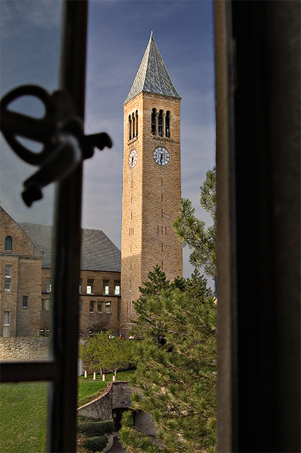
The picture is skewed mildly and I think rotatation to correct this would have helped .. there is a slant .. I am not sure that line you rotated this to previously .. but the tower itself the open window and the frame are not straight - and this struck me on first viewing during voting.
Getting in the whole window frame may have helped .. or pushing the window as wide as possible to remove destration of the dirty glass and the handle ... Just a couple of ideas.
Subject:
Meets the challenge.
Technical (Colour and light):
I thinnk these are fine, but going from the comments received you may no longer .. check out what happens when the contrast is upped .. I think it may kill the picture .. but you never know.
To grow its vote?:
Just play around and see what happens ...
Summary:
Keep on trying you are improving all the time ... can't wait to see more.
If you've got any questions about this critique, please feel free to contact me via the PM system.
Cheers
Kari |
|
Comments Made During the Challenge  |
|
|
04/30/2006 11:20:49 PM |
| the bar takes up a lot of the focus here. otherwise a nice pic |
|
 Photographer found comment helpful. Photographer found comment helpful. |
|
|
04/30/2006 08:44:34 PM |
| i like this, but the window frame draws away from the tower |
|
| Photographer found comment helpful. |
|
|
04/30/2006 02:11:57 PM |
| Love the DOF and the light! |
|
| Photographer found comment helpful. |
|
|
04/30/2006 11:17:48 AM |
| The sky looks very odd and doesn´t really fit with the tower, next time you are going to specifically work on the sky, make sure there are no telltale signs that you did so, like the strong halo around the tower. Other than that, pretty good and I really like this shot, especially the composition, gave this a 7. |
|
| Photographer found comment helpful. |
|
|
04/30/2006 01:43:26 AM |
| Good choice of subject. The handle of the window is pretty powerful and a bit distracting. |
|
| Photographer found comment helpful. |
|
|
04/29/2006 08:16:38 PM |
| Excellent lighting and framing. Might have opened the window a tad more if it were possible. |
|
| Photographer found comment helpful. |
|
|
04/29/2006 04:22:05 PM |
| Nice. I like the colors and the contrast between inside and outside. |
|
| Photographer found comment helpful. |
|
|
04/29/2006 10:52:14 AM |
| Nice photo, I like the way you opened the window just enough to capture the subject. Well done and good luck. |
|
| Photographer found comment helpful. |
|
|
04/29/2006 07:23:53 AM |
| Nice composition and crop |
|
| Photographer found comment helpful. |
|
|
04/29/2006 07:05:56 AM |
| The only thing I don't like is the window handle. It is a little distracting. To bad you didn't have a window without it. |
|
| Photographer found comment helpful. |
|
|
04/29/2006 05:48:02 AM |
|
| Photographer found comment helpful. |
|
|
04/28/2006 08:44:04 PM |
| A slight bump in contrast would be good. |
|
| Photographer found comment helpful. |
|
|
04/27/2006 09:42:40 AM |
| I like the depth and clarity of this image. Good job. |
|
| Photographer found comment helpful. |
|
|
04/25/2006 01:41:12 PM |
| This is nice. The lock on the window frame is a little distracting. |
|
| Photographer found comment helpful. |
|
|
04/25/2006 03:28:48 AM |
| Nice DOF and good clarity! |
|
| Photographer found comment helpful. |
|
|
04/24/2006 12:10:44 AM |
|
Home -
Challenges -
Community -
League -
Photos -
Cameras -
Lenses -
Learn -
Help -
Terms of Use -
Privacy -
Top ^
DPChallenge, and website content and design, Copyright © 2001-2026 Challenging Technologies, LLC.
All digital photo copyrights belong to the photographers and may not be used without permission.
Current Server Time: 02/01/2026 12:24:57 PM EST.