| Author | Thread |
Comments Made During the Challenge  |
|
|
04/30/2006 11:23:19 PM |
|
 Photographer found comment helpful. Photographer found comment helpful. |
|
|
04/30/2006 09:55:35 PM |
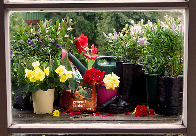
| A bit of cropping would have helped here, that and a small rotation down to the right as it´s slightly leaning down to the left. |
|
| Photographer found comment helpful. |
|
|
04/30/2006 08:41:15 PM |
| like this, the window seems more like a photoshop border then a window though |
|
| Photographer found comment helpful. |
|
|
04/30/2006 07:34:25 PM |
| It's a window, and it's a selection of gardening items. Not sure why I should find it interesting though. |
|
| Photographer found comment helpful. |
|
|
04/30/2006 02:07:04 PM |
|
| Photographer found comment helpful. |
|
|
04/30/2006 09:44:26 AM |
| Nice colors, well framed and composed. The "General Garden" bag is a distraction. |
|
| Photographer found comment helpful. |
|
|
04/29/2006 04:49:10 PM |
| This could be an add for a gardening/outdoor shop. |
|
| Photographer found comment helpful. |
|
|
04/29/2006 10:23:11 AM |
| Looks just like an ad for gardening products. Great job, wish I still had my garden. |
|
| Photographer found comment helpful. |
|
|
04/29/2006 07:27:30 AM |
|
| Photographer found comment helpful. |
|
|
04/29/2006 02:58:48 AM |
| Nice color and subject. Things feel a bit staged or placed. good work. |
|
| Photographer found comment helpful. |
|
|
04/28/2006 08:52:22 PM |
| Good set up. I might have left the 'general garden' bag out. The rose petals are a nice touch and you colors are good. |
|
| Photographer found comment helpful. |
|
|
04/27/2006 09:13:58 AM |
|
| Photographer found comment helpful. |
|
|
04/26/2006 09:51:07 PM |
| I am a gardener also, so I just love this shot, great colors, only distraction I see is the slightly blown highlights on the yellow flowers, those are so hard to get right with any sunshine whatsoever. Good luck |
|
| Photographer found comment helpful. |
|
|
04/26/2006 12:17:10 PM |
| The subject is very sharp through the window. Some of your highlights are just a bit blown out. I personally would have cropped a little more at top & bottom to get rid of the edges of those panes. i really like the layout on this. Almost like a painting. |
|
| Photographer found comment helpful. |
|
|
04/24/2006 04:50:17 AM |
| This could be an add, great shot! Maybe you could crop the underside a bit |
|
| Photographer found comment helpful. |
|
|
04/24/2006 04:16:20 AM |
| lols. Good Gracious is a great phrase, Ima happy you used it in your title. |
|
| Photographer found comment helpful. |
Home -
Challenges -
Community -
League -
Photos -
Cameras -
Lenses -
Learn -
Help -
Terms of Use -
Privacy -
Top ^
DPChallenge, and website content and design, Copyright © 2001-2026 Challenging Technologies, LLC.
All digital photo copyrights belong to the photographers and may not be used without permission.
Current Server Time: 02/01/2026 11:24:33 AM EST.