| Author | Thread |
Comments Made During the Challenge  |
|
|
05/02/2006 04:48:19 PM |
| Meets the challenge however I don't find this all that interesting to be honest. Mind you it's not easy to make something like this interesting so that's why getting creative in your technique is vital. One possible way to do that is to take a less than common angle say much lower so that the pin stacked on top has some height to it vs the flatness it has when shooting above it. Also, I'd move the subject that you have in focus off-center. |
|
 Photographer found comment helpful. Photographer found comment helpful. |
|
|
05/01/2006 10:11:54 PM |
| center of attention not great... also the pic seems a unsharp |
|
| Photographer found comment helpful. |
|
|
04/30/2006 04:58:06 PM |
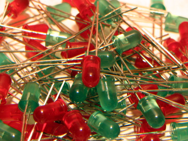
| ouch, beans and needles do not mix well... trust me |
|
| Photographer found comment helpful. |
|
|
04/30/2006 03:02:28 PM |
| need something more interesting |
|
| Photographer found comment helpful. |
|
|
04/30/2006 01:50:43 PM |
| This image is very...uninteresting, sorry. |
|
| Photographer found comment helpful. |
|
|
04/30/2006 05:19:13 AM |
| un appealing esthetically |
|
| Photographer found comment helpful. |
|
|
04/29/2006 04:17:11 PM |
| This has potential but there is something about the color that needs help. |
|
| Photographer found comment helpful. |
|
|
04/29/2006 05:30:34 AM |
|
| Photographer found comment helpful. |
|
|
04/28/2006 11:31:02 PM |
| This seems a bit too busy ;( |
|
| Photographer found comment helpful. |
|
|
04/27/2006 09:55:04 PM |
| I think this picture has a color cast to it... it is also overall bland or dull... not as sharp as it could be either.4 |
|
| Photographer found comment helpful. |
|
|
04/27/2006 04:39:08 AM |
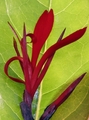
| very busy but nice use of red and green |
|
| Photographer found comment helpful. |
|
|
04/26/2006 07:24:39 PM |
|
| Photographer found comment helpful. |
|
|
04/26/2006 04:37:56 PM |
| I really like the concept, I think it would have worked better on a black background, with some softer lighting. Maybe even kick it up a notch and have them lite up. I know it would be hard but just think how cool it could be! |
|
| Photographer found comment helpful. |
|
|
04/26/2006 03:30:05 PM |
| 3 - Looks 'snapshottish' and too haphazard without being intentionally so. Too close and OOF and overall not balanced or enough 'depth'. Perhaps a tweaking in pp may have given this a little extra, not sure. |
|
| Photographer found comment helpful. |
|
|
04/26/2006 01:45:34 AM |
| this is relly out of focus and soft |
|
| Photographer found comment helpful. |
Home -
Challenges -
Community -
League -
Photos -
Cameras -
Lenses -
Learn -
Help -
Terms of Use -
Privacy -
Top ^
DPChallenge, and website content and design, Copyright © 2001-2025 Challenging Technologies, LLC.
All digital photo copyrights belong to the photographers and may not be used without permission.
Current Server Time: 04/07/2025 01:41:38 PM EDT.