| Author | Thread |
|
|
05/07/2006 01:53:22 PM |
Greetings from your own critique club.
First Impression
Very Nice shot.
Composition:
Very good composition.
Subject:
I really like the subject. Nice take on the challenge.
Technical (Colour and light):
The color and lighting in the front is perfect, but needs to be bumped little bit in the backgroud.
Improvement:
Color saturation in the background, contrast and lighting. Some voters on DPC are very strict about meeting the challenge. Tha challenge said Window like a building window, just wondering that may be the this didn't finish higher.
Summary:
Little bit more PP, try to please majority of voters by meeting the challenge criteria.
Over all very nice image. Congrates on your Personal Best.
Message edited by author 2006-05-07 17:54:17. |
|
 Photographer found comment helpful. Photographer found comment helpful. |
|
|
05/03/2006 05:14:49 PM |
| Congrats on a strong finish on this image. I'm a real sucker for landscapes. |
|
|
|
05/01/2006 11:05:55 AM |
Originally posted by scrum8:
I might have tried a little lower angle to get more sky and less green. Just a minor thing. |
Did you know that mountains look bigger when there is less visible sky? Hence... |
|
|
|
05/01/2006 11:04:21 AM |
Originally posted by judojoe:
I had a bit Gripe on last week as to why somewone would give me only 1 point for a photo, and to find 3 people gave you 1 point is amazing - who are these people.
They must be jealous is the only thin I can think of.
Your picture is a Beltta, well done |
A lot of folks were put off by the anti-DNMC title, others just decided it was DNMC despite it. Whatever - even ribbon winners get 1's! |
|
|
|
05/01/2006 12:13:12 AM |
I had a bit Gripe on last week as to why somewone would give me only 1 point for a photo, and to find 3 people gave you 1 point is amazing - who are these people.
They must be jealous is the only thin I can think of.
Your picture is a Beltta, well done |
|
| Photographer found comment helpful. |
Comments Made During the Challenge  |
|
|
04/30/2006 05:23:19 PM |
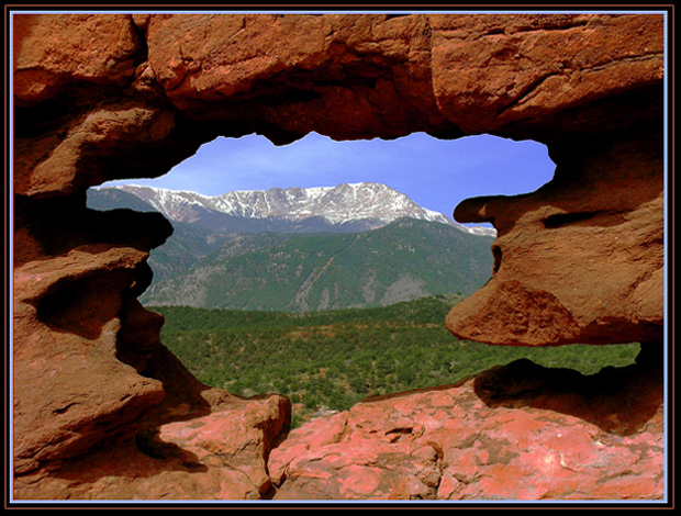
| Nice find on the rock window, horrible title though, hate titles that "explain the photo", trust me, voters are not stupid in general and they´ll figure it out. |
|
|
|
04/30/2006 04:50:12 PM |
| natural windows work for me, great capture |
|
|
|
04/30/2006 11:13:06 AM |
| If my vote counted I would say this will be top 10, great shot and good luck. |
|
|
|
04/30/2006 08:29:34 AM |
| haaaa garden of the gods. I usto live in the springs |
|
|
|
04/30/2006 01:37:03 AM |
| This is good ,i like it ,may be needs tiny bit of sharpening but the rest is just fine 8 |
|
|
|
04/29/2006 04:18:04 PM |
| I might have tried a little lower angle to get more sky and less green. Just a minor thing. |
|
|
|
04/29/2006 03:44:06 PM |
|
|
|
04/29/2006 12:31:11 PM |
It's never a good sign when you have to build in a defense of your definition into the title.....I will give you the benefit of the doubt anyhow.
The "window" is a bit dominating relative to the blues and greens of the subject. I would love to see it in person some time. Must be beautiful. |
|
| Photographer found comment helpful. |
|
|
04/29/2006 12:00:14 PM |
| Deduction for excessive title... (just kidding!) Nice, unique approach to the challenge. Foreground rocks may be just a tad bright, drawing away a bit from the apparent subject of the mountain. |
|
| Photographer found comment helpful. |
|
|
04/29/2006 11:19:24 AM |
| very interesting direction to go with a "window" challenge. clever |
|
| Photographer found comment helpful. |
|
|
04/29/2006 09:51:16 AM |
| i love this one. beautiful and majestic and the colors works well too ;) |
|
| Photographer found comment helpful. |
|
|
04/29/2006 06:54:30 AM |
| Boy I hope this does well, I wanted to do a naturally framed entry but was worried about the whole DNMC thing. Hope you are not getting that because this is great. Good luck! |
|
| Photographer found comment helpful. |
|
|
04/29/2006 04:29:43 AM |
|
| Photographer found comment helpful. |
|
|
04/29/2006 03:25:21 AM |
| I like the composition is very nice. It meets the challenge perfectly. The colour and light are ok. |
|
| Photographer found comment helpful. |
|
|
04/28/2006 08:35:57 PM |
| Nice picture love the reds of the rocky frame and then the color of the framed landscape |
|
| Photographer found comment helpful. |
|
|
04/28/2006 04:39:31 PM |
| I see that you are afraid of DNMC comments :-) |
|
|
|
04/28/2006 12:57:45 PM |
I'm not going to mark you down for it, but I am very put of by your title. I don't need a definition of 'window' when voting...
TC |
|
| Photographer found comment helpful. |
|
|
04/27/2006 09:28:49 PM |
| I dont care for the looonggg title, but its a very pretty pic. Maybe a slight bump in contrsat for the mountain and forest would have been nice |
|
|
|
04/27/2006 07:05:23 PM |
| dump the title...geez...image speaks for itself 8 |
|
|
|
04/27/2006 09:59:48 AM |
| This is a great shot. It is also a great stretch. I don't know about Wikipedia, but it isn't in Funk & Wagnalls or Websters. |
|
|
|
04/27/2006 09:07:25 AM |
Pikes Peak would have sufficed- all the rest really isn't necessary.
Message edited by author 2006-05-01 10:47:46. |
|
|
|
04/26/2006 07:15:40 PM |
| DNMC. Just Kidding!!! This is gorgeous shot and meets the challenge perfectly! Love the colors. |
|
|
|
04/26/2006 05:30:49 PM |
| The green and blues set within the reddish stones is really nicely done. Beautiful scenery, good luck |
|
|
|
04/25/2006 06:26:17 PM |
I like it!
The "window" does seem a little imposing & takes over the shot, whereas normally it should enhance the shot without being overbearing. |
|
|
|
04/25/2006 02:23:56 PM |
you're probably regretting that light blue border by now, it's overkill.
good idea, hints of oversharpening on edges of "window" esp the upper part. |
|
|
|
04/25/2006 08:13:18 AM |
| ha, I love how DPC has forced us to start using the title to explain ourselves. Don't worry, I'm not going to knock you. nice shot. The lower right looks a little harsh or saturated. Some masking may have been nice there. The red and blue contrast well. 8 |
|
|
|
04/24/2006 07:47:06 PM |
|
|
|
04/24/2006 05:44:22 PM |
| Beautiful shot. You Come upon these opportunities by chance and take advantage of them through experience.... Did you have a polarizer... who knows... if you did not and you had employed one the photo would have popped and given you a 9 or 10. Great eye. 8 |
|
|
|
04/24/2006 10:08:48 AM |
| I'll buy that it's a window. Beautiful shot! |
|
|
|
04/24/2006 05:22:25 AM |
hi, the photo is awesome !
but ... the frame is the only thing i don't like :-| |
|
|
|
04/23/2006 09:06:15 PM |
| the photo is good - the long title unnecessary |
|
|
|
04/23/2006 08:12:33 PM |
| hahaha that's funny that yes, on dpc, you would have to put an explanation for a natural window! but I love the shot...you deserve a 10 |
|
Home -
Challenges -
Community -
League -
Photos -
Cameras -
Lenses -
Learn -
Help -
Terms of Use -
Privacy -
Top ^
DPChallenge, and website content and design, Copyright © 2001-2025 Challenging Technologies, LLC.
All digital photo copyrights belong to the photographers and may not be used without permission.
Current Server Time: 04/07/2025 01:09:24 AM EDT.