| Author | Thread |
Comments Made During the Challenge  |
|
|
05/02/2006 06:41:56 PM |
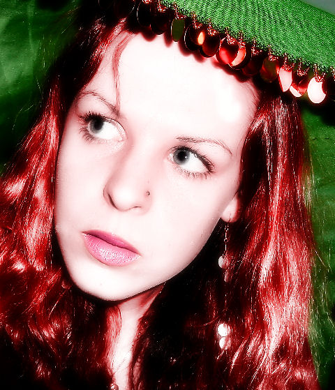
| Great for challenge , lighting a little harsh though. |
|
 Photographer found comment helpful. Photographer found comment helpful. |
|
|
04/30/2006 10:16:55 PM |
|
| Photographer found comment helpful. |
|
|
04/30/2006 08:15:49 PM |
|
| Photographer found comment helpful. |
|
|
04/30/2006 04:40:53 PM |
| it seems the face might be blown out a little too much |
|
| Photographer found comment helpful. |
|
|
04/30/2006 02:16:56 PM |
| You look like our friend from down under ;) The red hair and the greens truly create compliments here. I'm not sure if that's a hat or just a piece of fabric above your head. The lighting seems a bit bright as well. 7 |
|
| Photographer found comment helpful. |
|
|
04/30/2006 08:04:58 AM |
| colors fit the challenge but its a bit too aggressve (over sharpened the hair?) |
|
| Photographer found comment helpful. |
|
|
04/29/2006 09:35:21 PM |
| Well this is definately complementary colours! Subject looks a bit over-flashed but you have lost no detail so maybe not. I like the expression, almost could be candid. Well done and good luck! 8 |
|
| Photographer found comment helpful. |
|
|
04/29/2006 01:41:04 PM |
| forehead blown out somewhat, neat look though. 6 |
|
| Photographer found comment helpful. |
|
|
04/29/2006 12:28:33 PM |
| I would normally gripe about the overprocessed skin but in this one I rather like it I would bring it down a bit seems to be too bright for my taste...This image to mee wants to be dark and moody |
|
| Photographer found comment helpful. |
|
|
04/29/2006 03:55:19 AM |
| Maybe it was intentional, but for me the face is a bit too bright. Details got lost. |
|
| Photographer found comment helpful. |
|
|
04/29/2006 01:33:41 AM |
| i see what you were going for....it just feels like it didn't exactly work. i'm not sure why. |
|
| Photographer found comment helpful. |
|
|
04/28/2006 05:13:19 PM |
| This is really nice, she reminds me of a very young Katherine Hepburn. |
|
| Photographer found comment helpful. |
|
|
04/27/2006 10:06:39 PM |
| I think the blowouts are too distracting. |
|
| Photographer found comment helpful. |
|
|
04/27/2006 05:23:40 PM |
| This is so striking. I love the soft tones in the face. . .and those eyes are aMAZING! My only small complaint is that looks like oversharpening or something in her hair that almost makes it look over-exposed. But its beautiful and appealing, and my favorite so far. 8 |
|
| Photographer found comment helpful. |
|
|
04/27/2006 09:32:12 AM |
| Interesting. I think the crop seems a bit tight, but I like the idea of this alot. |
|
| Photographer found comment helpful. |
|
|
04/26/2006 11:12:58 PM |
|
| Photographer found comment helpful. |
|
|
04/26/2006 10:34:30 PM |
| 2 - Good potential. Less face and more 'colors' used, make this better in my opinion. LIghting, whilst perhaps intentional, too bright or 'direct'/something, in my opinion. An overall more balanced composition and refined crop, also have helped this. |
|
| Photographer found comment helpful. |
|
|
04/26/2006 08:08:30 PM |
| Nice colors but I don't especially like the processing in the face. It's a bit bright. |
|
| Photographer found comment helpful. |
|
|
04/26/2006 02:32:30 PM |
| Lighting's a bit too harsh IMHO. |
|
| Photographer found comment helpful. |
|
|
04/26/2006 01:01:24 PM |
| Pretty nice, very lovely. But maybe a bit too much smoothing in the face. |
|
| Photographer found comment helpful. |
|
|
04/26/2006 06:59:12 AM |
| red and green...well captured here |
|
| Photographer found comment helpful. |
|
|
04/26/2006 01:58:58 AM |
|
| Photographer found comment helpful. |
Home -
Challenges -
Community -
League -
Photos -
Cameras -
Lenses -
Learn -
Help -
Terms of Use -
Privacy -
Top ^
DPChallenge, and website content and design, Copyright © 2001-2026 Challenging Technologies, LLC.
All digital photo copyrights belong to the photographers and may not be used without permission.
Current Server Time: 02/01/2026 09:33:31 AM EST.