| Author | Thread |
Comments Made During the Challenge  |
|
|
05/01/2006 02:55:55 AM |
|
|
|
04/30/2006 02:41:42 PM |
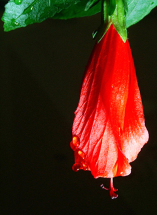
| great color, but it seems to me the focus is a tiny bit off |
|
|
|
04/30/2006 01:51:31 PM |
| I would have liked it better if it were a life hibiscus, as opposed to a half dead one... |
|
|
|
04/30/2006 02:39:12 AM |
| Its a shame it isnt a bit bigger. but i like the simplictity good choice for a black background |
|
|
|
04/29/2006 10:21:41 AM |
| i think a better looking hibuiscus would have helped. this just looks wilted and unappealing IMHO |
|
|
|
04/29/2006 05:35:33 AM |
|
|
|
04/27/2006 09:51:57 PM |
| One of the reasons I didn't enter this challenge was because I was not creative enough to think of a picture that exhibited complementary colors and didn't involve a flower... I see that you too have failed at at least one of these, but a nice picture none-the-less. 6 |
|
 Photographer found comment helpful. Photographer found comment helpful. |
|
|
04/26/2006 07:17:39 PM |
|
|
|
04/26/2006 03:01:10 PM |
| 3 - Potential looks like it is there. Bigger (640 height), variation in lighting, sharper focus, more depth and better control of the reds make this much better in my opinion. Background is grainy and also dominates too much in this shot. Like to see the detail in the flower and petals and more leaves/green incorporated too. Composition is quite good. Up to 3 from 2, because it looks like you put some though into the arrangement/composition and framing. |
|
| Photographer found comment helpful. |
|
|
04/26/2006 10:45:22 AM |
| Simple. Quite lovely and the colours balance each other enough to be called truly complementary, but both of them are chiefly played off against the black. |
|
| Photographer found comment helpful. |
|
|
04/26/2006 05:46:42 AM |
| Nice picture, I might have liked to see a little more of the green 6 |
|
|
|
04/26/2006 03:34:59 AM |
| too small to really comment on properly |
|
|
|
04/26/2006 02:49:21 AM |
| would like to have seen more green as part of the comp. reds seem blown at the bottom of the blossom. |
|
|
|
04/25/2006 09:12:20 PM |
| why use such a small image when you can you can submit a larger one....makes it harder to judge |
|
Home -
Challenges -
Community -
League -
Photos -
Cameras -
Lenses -
Learn -
Help -
Terms of Use -
Privacy -
Top ^
DPChallenge, and website content and design, Copyright © 2001-2025 Challenging Technologies, LLC.
All digital photo copyrights belong to the photographers and may not be used without permission.
Current Server Time: 04/07/2025 01:24:01 PM EDT.