| Author | Thread |
Comments Made During the Challenge  |
|
|
08/08/2003 12:36:39 AM |
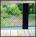
| Colors look washed out. This image would probably look very nice in b&w. Composition is good. |
|
|
|
08/07/2003 05:36:45 AM |
| Like the find, the colors are full and you could have gotten away with out the sign. also a better angle might have been chosed to have the subject straighter and could use a better composition...too centered. |
|
|
|
08/05/2003 10:24:07 PM |
| Meets the challenge by having plenty of right angles but otherwise does no do much, in the very least the picture should have been taken with a dead on angle .... |
|
|
|
08/05/2003 09:12:26 PM |
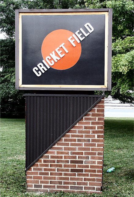
Composition = 6
Challenge = 10
Technical = 10
Creativity = 5
X2 Wow factor = 5
36/6=6
rounds to = 6
congrats
|
|
Home -
Challenges -
Community -
League -
Photos -
Cameras -
Lenses -
Learn -
Help -
Terms of Use -
Privacy -
Top ^
DPChallenge, and website content and design, Copyright © 2001-2025 Challenging Technologies, LLC.
All digital photo copyrights belong to the photographers and may not be used without permission.
Current Server Time: 04/09/2025 07:34:39 PM EDT.