| Author | Thread |
|
|
08/14/2003 04:56:34 PM |
Hi again Anna - more critique fun.
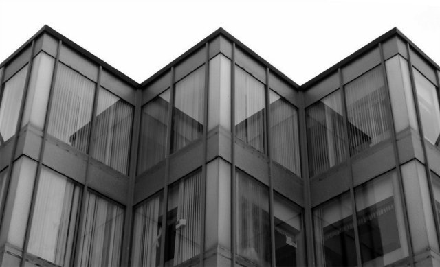
Immediate impression - it seems soft-focussed, and feels not quite horizontal. The soft-focus thing is really quite bizarre though: looking at the shadow lines, and the top edge, it seems plenty sharp enought there - so i think it must be the tonality of the panels and the glass that give it. As to the horizontal - I'd have to measure it: on closer inspection sometimes it looks OK, and sometimes off.
Obviously meets the challenge - no issues there.
It doesn't have much impact for me: the way the centre part of the building appears to continue into the relection is pretty effective - approaches timmi's shot that placed 3rd - but isn't emphasised by the composition, or the light. The subject is plainly, and not just because of the title, the line of the top of the building; and whilst it's clear that that is right angles, perhaps it would have been more effective if it had been a genuine right angle on screen: I think that might have looked quite striking.
Still, 5.6 is not a bad finish.
Ed |
|
Comments Made During the Challenge  |
|
|
08/12/2003 11:32:07 AM |
| This would probably have been better cropped to the edge of the 'W' extremeties. Nice reflections but contrast could have been better. |
|
|
|
08/11/2003 07:58:45 PM |
| This is a really nice composition and shot. I especially like the echoing right angles in the reflections, and the way it makes this into a multi-layered photo, as it were. |
|
 Photographer found comment helpful. Photographer found comment helpful. |
|
|
08/11/2003 03:53:45 PM |
|
|
|
08/09/2003 07:34:49 AM |
|
| Photographer found comment helpful. |
|
|
08/08/2003 10:39:34 AM |
| Nice shot, fits the challenge well. |
|
| Photographer found comment helpful. |
|
|
08/08/2003 08:47:58 AM |
| One of the few who got it |
|
| Photographer found comment helpful. |
|
|
08/07/2003 08:57:13 PM |
| Such wonderful tones on the building. Very very nice. |
|
| Photographer found comment helpful. |
|
|
08/07/2003 05:52:48 AM |
|
| Photographer found comment helpful. |
|
|
08/07/2003 05:38:57 AM |
| good title, medium shot 5 |
|
| Photographer found comment helpful. |
|
|
08/07/2003 03:56:01 AM |
|
| Photographer found comment helpful. |
|
|
08/07/2003 03:54:49 AM |
| great angles. a bit gloomy, but not too bad. |
|
| Photographer found comment helpful. |
|
|
08/06/2003 06:30:35 PM |
|
| Photographer found comment helpful. |
|
|
08/06/2003 06:27:04 PM |
| nicely done. more sky would have brought the most prominent of the angles near the center of the picture, giving focus to the theme. could use some sharpening. good exposure and crop. 7 |
|
| Photographer found comment helpful. |
|
|
08/05/2003 08:23:31 PM |
| Interesting subject. I like the title. |
|
| Photographer found comment helpful. |
Home -
Challenges -
Community -
League -
Photos -
Cameras -
Lenses -
Learn -
Help -
Terms of Use -
Privacy -
Top ^
DPChallenge, and website content and design, Copyright © 2001-2025 Challenging Technologies, LLC.
All digital photo copyrights belong to the photographers and may not be used without permission.
Current Server Time: 04/07/2025 12:47:58 PM EDT.