| Author | Thread |
|
|
04/29/2006 10:31:11 AM |
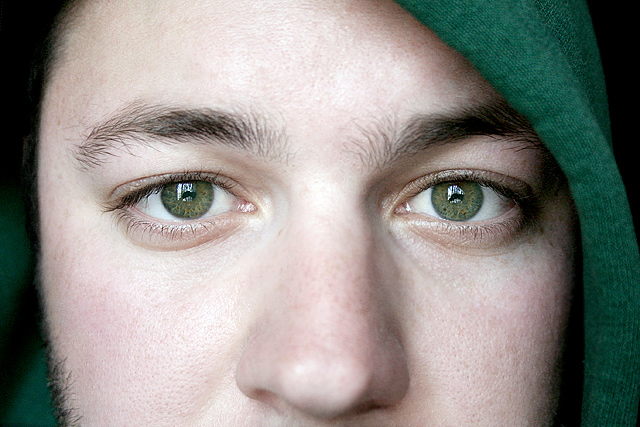
Hello, and greetings from the Critique Club. What follows is my best attempt to Critique this photo from a DPC voter's point of view. I'll do my best, but please excuse any comments that may be unintentionally rude or insulting.
Initial Thoughts
A little too close in. For studio portraits, I expect people are looking to see more studio, and less "person", if you know what I mean
Composition/Content
Nice composition, although suffers from being neither close enough in, or far enough out, IMO. The head covering is a neat idea, but for some reason doesn't really add anything in this instance. Eyes are great, but lack that extra something.
Background
N/A
Camera Work/Technical
Decent camera work, but your lighting is a little too flat. Not enough shadows, texture, or dynamics there to really set anything apart or bring it out.
Digital Processing
Some good work, but I think more attention payed to bringing out the eyes, and darkening the areas around them might have pushed your score up. Voters love that "dragan" look, and getting a shot like this closer to that look would have helped dramatically.
Fits the Challenge
Iffy on this one. As I said, I think voters were expecting to see more of a studio environment as well as the model, so you might have been hit for that. So it fits the challenge *technically*, but misses the mark because of the lack of showing the environment.
My Opinion of the Photo
A nicely done close-up that just lacks the punch to make me really care about the photo. |
|
 Photographer found comment helpful. Photographer found comment helpful. |
Comments Made During the Challenge  |
|
|
04/23/2006 07:23:49 PM |
| Good lighting, great texture, but I'd have gone for a square crop and included the mouth |
|
| Photographer found comment helpful. |
|
|
04/23/2006 07:19:52 PM |
I like this, and I love that you don't have a title, I rarely look at them because I think the images should speak for them selves and tie into a challenge theme on its own merrits, and your does.
I like the play of the greens on one another. |
|
| Photographer found comment helpful. |
|
|
04/23/2006 06:21:56 PM |
|
| Photographer found comment helpful. |
|
|
04/23/2006 03:48:08 PM |
| the nose at this range is rather distacting :-) |
|
| Photographer found comment helpful. |
|
|
04/23/2006 12:19:08 PM |
| Great stare and texture in the pupils. A bit mor color/saturation would have helped them pop out a bit more in my opinion. Very nice. |
|
| Photographer found comment helpful. |
|
|
04/22/2006 10:02:28 AM |
| Nice. I just feel this would have been better with little warmer tones. Reflection in eyes is little distracting (just a little). Still different from others and pleasing photo.8. |
|
| Photographer found comment helpful. |
|
|
04/20/2006 05:53:50 PM |
| very cool - like the balance of the photo |
|
| Photographer found comment helpful. |
|
|
04/20/2006 04:35:48 PM |
| Is that you, David? Great shot...the lighting and color are really nice. :) |
|
| Photographer found comment helpful. |
|
|
04/20/2006 03:06:20 PM |
| what eyes. If not for the reflections... |
|
| Photographer found comment helpful. |
|
|
04/20/2006 11:47:14 AM |
| I think I see you in the eyes |
|
| Photographer found comment helpful. |
|
|
04/18/2006 04:14:55 PM |
Looks more like a candid than a portrait.
Most portraits include eyes only or the whole face.
leaving the nose in is a little unorthodox and confusing I might add |
|
| Photographer found comment helpful. |
|
|
04/17/2006 07:12:59 PM |
| Lovely eye color, but I think we're just a tad too close and "in his face". |
|
| Photographer found comment helpful. |
|
|
04/17/2006 01:37:24 PM |
| love the green around the head and the green eyes. lovely. a 9 from me! |
|
| Photographer found comment helpful. |
|
|
04/17/2006 01:20:23 AM |
| Very sharp and clear, I wonder how much more impact you'd have gotten with some darkening and contrast adjustment. There's so much good light there to work with, it's maybe just a little too much aat present |
|
| Photographer found comment helpful. |
|
|
04/16/2006 09:13:39 PM |
| I would have cropped the nose off..Beautiful green eyes. |
|
| Photographer found comment helpful. |
|
|
04/16/2006 08:36:20 PM |
| The eyes are beautiful. I'd like to see the mouth, though. This looks sort of cut off. |
|
| Photographer found comment helpful. |
Home -
Challenges -
Community -
League -
Photos -
Cameras -
Lenses -
Learn -
Help -
Terms of Use -
Privacy -
Top ^
DPChallenge, and website content and design, Copyright © 2001-2025 Challenging Technologies, LLC.
All digital photo copyrights belong to the photographers and may not be used without permission.
Current Server Time: 04/07/2025 02:36:59 PM EDT.