| Author | Thread |
|
|
04/26/2006 09:47:00 PM |
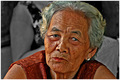
Greetings from the Critique Club :-)
A very fitting entry for this challenge, I think. She is a very engaging character, and I think you have captured that character well. I like how you've really displayed the texture, and showcased all the wonderful years that this visage has experienced. A classic portrait head shot composition, and obviously works fine for this photo. Nice job with the background too.
I think the main thing I'd like to discuss here is the lighting of the shot. It's not bad, I think it seems purposeful and thought out, and is heading towards a goal, but a couple of things strike me about it. First of all, I like the sidelighting thing, going back to the texture, and I really like how it lights up the hair, adds a lot to the appeal of the character of Nana :-) However, it seems on the verge of being too harsh on the left. Not too bad, but I think what it does is really emphasize the dark areas in a slightly negative way, especially around the eyes. What I'm wondering is perhaps getting some reflected light from the bottom right area could lighten up the eyes and dark areas a touch, just enough to get back some of the detail there. This could even be as simple as having Nana hold white poster board or something out of the frame. Something to think on anyways maybe. A couple of commenters mentioned the tone, or slight hue. I can see that, but it is a minor thing I think. As graphicfunk pointed out, perhaps a slight drop in saturation could make a difference. Even just a little slight tweaking in levels, or selective color maybe?
Overall, a very nice, touching portrait. I think you've done a fine job of catching Nana's essence, and conveying your love and respect in the shot. I think this is a set of photos that years down the road, you will cherish and revisit many times :-)
If you have any questions or comments or anything, please feel free to contact me.
Happy shooting,
taterbug :-) |
|
 Photographer found comment helpful. Photographer found comment helpful. |
|
|
04/25/2006 09:20:45 PM |
| Wow... this was my #1 pic |
|
| Photographer found comment helpful. |
|
|
04/25/2006 09:16:22 PM |
| I love the texture you've captured here. Very nice. |
|
| Photographer found comment helpful. |
Comments Made During the Challenge  |
|
|
04/25/2006 07:09:01 PM |
| Very nice subject and expression. I would have cut the saturation just a bit to avoid the tone from distracting. 6 |
|
| Photographer found comment helpful. |
|
|
04/24/2006 03:34:32 AM |
wait...huh? are the two same pictures here? I though i already left a comment on this one....the lighting seems different...
Ok, no i was wrong. Damn, with all of this studying for exams i must be loosing it.
To the point: i thought i recall leaving a message saying the following:
Great texture but the lighting in the top left is a little to harsh and makes the eyes very dark. it would have been nice to see more of her eyes. good work though
The next day: ok, nooow i get it. There is a similar picture of this women on the portrait challenge, that's why I got all confused. |
|
| Photographer found comment helpful. |
|
|
04/21/2006 09:53:26 PM |
| This is almost a great photograph, but the lack of a highlight in her left eye is really bothersome. You did a great job of capturing the texture of her skin and hair, though. |
|
| Photographer found comment helpful. |
|
|
04/21/2006 05:55:47 PM |
| This is a really nice portrait... |
|
| Photographer found comment helpful. |
|
|
04/20/2006 09:23:23 AM |
| She looks like a lovable, kind, and intelligent woman. I love the sharp focus you have and that glint in her eye, but I wish the light was slightly different, to eliminate some of the shiny spots on her skin. The light in her hair, however, is perfect. |
|
| Photographer found comment helpful. |
|
|
04/19/2006 11:33:50 PM |
| Pretty lady - well photographed. |
|
| Photographer found comment helpful. |
|
|
04/19/2006 05:08:18 PM |
| Yes they are :) old, soft, gentle and kind:) the pic is ok, but the name is great and rates the pic up, at least for me,, 9 |
|
| Photographer found comment helpful. |
|
|
04/19/2006 02:54:20 PM |
| Still to red skin tone .. ice |
|
| Photographer found comment helpful. |
|
|
04/19/2006 11:15:14 AM |
| I think the overall tone is a tad harsh. I can't tell if it's too saturated or it's the lighting. The detail is good. |
|
| Photographer found comment helpful. |
|
|
04/19/2006 03:11:47 AM |
|
| Photographer found comment helpful. |
|
|
04/18/2006 08:46:22 PM |
| Same person as the last challenge. Pose/composition nearly identical, lighting still as harsh. :-( |
|
| Photographer found comment helpful. |
Home -
Challenges -
Community -
League -
Photos -
Cameras -
Lenses -
Learn -
Help -
Terms of Use -
Privacy -
Top ^
DPChallenge, and website content and design, Copyright © 2001-2025 Challenging Technologies, LLC.
All digital photo copyrights belong to the photographers and may not be used without permission.
Current Server Time: 04/07/2025 04:45:01 AM EDT.