| Author | Thread |
|
|
04/28/2006 09:27:10 AM |
Greetings from the Critique Club
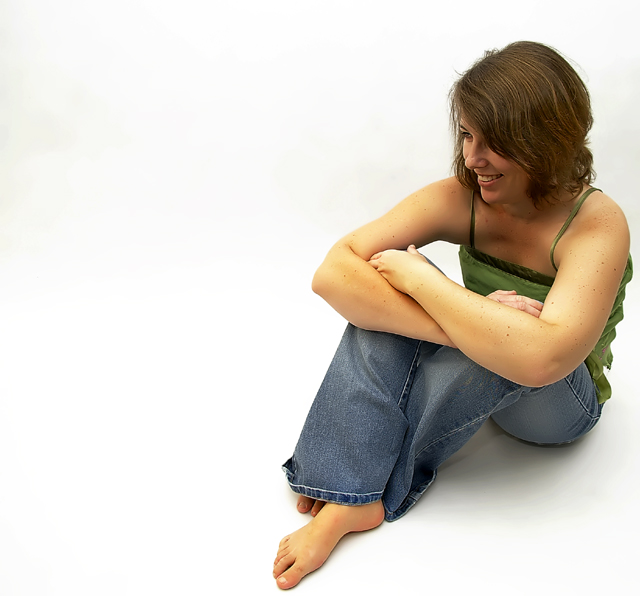
Well it looks like you have studio lighting down pat, so no nits in that department at all! I really like the composition (use of negative space) in this image. I think you would have scored much higher if the model's pose were tweaked just a bit: show her hands, don't hide them, show her eyes even if they're not looking directly at the camera, and watch the details like the folded hem on the jeans and lastly add a reflector to brighten up the dark area under her chin. Those are all minor nits and your image scored deservedly well. Congratulations.
|
|
 Photographer found comment helpful. Photographer found comment helpful. |
|
|
04/24/2006 02:54:58 AM |
Originally posted by GIS_boy:
Congrats baby, if only you had given this entry a title, who knows? |
Bite me!!! |
|
|
|
04/24/2006 02:28:58 AM |
| Well done Nic. Blue jeans always work very well with white backdrops and I like the framing/cropping you chose. Another solid finish for the team. |
|
| Photographer found comment helpful. |
|
|
04/24/2006 01:18:56 AM |
| Congrats baby, if only you had given this entry a title, who knows? |
|
| Photographer found comment helpful. |
|
|
04/24/2006 01:08:36 AM |
| Knew this was yours Nicole...well done. I really think it deserved to finish much higher. You are really good at these kind of shots. This is really my favourite shot of you...the pose is so relaxed and friendly...excellent. Makes me want to go and buy backdrops and studio lights |
|
| Photographer found comment helpful. |
|
|
04/24/2006 12:38:21 AM |
| Excellent shot, but I would have liked just a bit more ligbht on your face, and work on your titles, lol. |
|
| Photographer found comment helpful. |
Comments Made During the Challenge  |
|
|
04/23/2006 11:37:54 PM |
| nice framing and exposure |
|
| Photographer found comment helpful. |
|
|
04/23/2006 06:42:25 PM |
| Love the off center placement, one of the better ones in the challenge. |
|
| Photographer found comment helpful. |
|
|
04/23/2006 04:11:48 PM |
| I liked this shot alot. The white space on the left works very well especially with the focus of her eyes headed in that direction. Very nice. |
|
| Photographer found comment helpful. |
|
|
04/22/2006 01:33:34 PM |
| Simple, elegent and very natural expression. Its not easy to get such expressions in controlled studio shots. 9. |
|
| Photographer found comment helpful. |
|
|
04/21/2006 06:53:04 PM |
| This is a fun image, I really like this one - very simple and free. Only nit - I would have liked to have seen more of her face and pretty smile. Overall great composition - nicely done! |
|
| Photographer found comment helpful. |
|
|
04/20/2006 10:38:27 PM |
| I like the cleanness of this image; however, I would have liked to see both her eyes. |
|
| Photographer found comment helpful. |
|
|
04/19/2006 09:01:01 PM |
| too bad she's not looking at the camera, or at least in such a way taht we can see her face more. |
|
| Photographer found comment helpful. |
|
|
04/19/2006 02:52:52 PM |
| too much white space on the left. |
|
|
|
04/19/2006 07:00:42 AM |
|
| Photographer found comment helpful. |
|
|
04/19/2006 03:23:12 AM |
I like the placing of the model and the image of her but the marks on the background are a bit distracting
Nice skin tones |
|
| Photographer found comment helpful. |
|
|
04/18/2006 06:54:50 PM |
| Beautiful model, perfect composition and amazing lighting. 10 from me! |
|
| Photographer found comment helpful. |
|
|
04/18/2006 05:37:44 PM |
| Nice clean shot, very natural feel. |
|
| Photographer found comment helpful. |
|
|
04/18/2006 01:25:56 PM |
| Nice lighting but I would have liked to see her face more. |
|
| Photographer found comment helpful. |
|
|
04/18/2006 08:04:19 AM |
|
| Photographer found comment helpful. |
|
|
04/18/2006 02:10:44 AM |
|
| Photographer found comment helpful. |
|
|
04/17/2006 10:15:41 PM |
|
| Photographer found comment helpful. |
|
|
04/17/2006 05:24:28 PM |
| interesting composition... an 8 |
|
| Photographer found comment helpful. |
|
|
04/17/2006 01:56:07 PM |
| The back ground colors don't seem to be very even, I can see slightly dark areas on the far left side, above her arms and behind her head. Even though she is looking away from the camera I would like to see just a little eye contact. Nice lighting and composition. 8 |
|
| Photographer found comment helpful. |
|
|
04/17/2006 09:55:11 AM |
| different! but I like it! |
|
| Photographer found comment helpful. |
|
|
04/17/2006 09:24:45 AM |
| There are a few dark spots on your background which you should have cloned out (top left and left of the models face). Also I think if the model had turned her head and look more towards the camera it would have more impact since her hair is hiding most of her face. Nice sharp focus though. |
|
| Photographer found comment helpful. |
|
|
04/17/2006 07:47:04 AM |
| Wow...lovely relaxed portrait, great choice of clothes and really nice lighting |
|
| Photographer found comment helpful. |
|
|
04/17/2006 06:11:14 AM |
|
| Photographer found comment helpful. |
|
|
04/17/2006 02:33:22 AM |
| Hmmm self portrait or hubby? I'm gonna say self portrait. Only nitpick is the coloration blotch in the left edge. |
|
| Photographer found comment helpful. |
Home -
Challenges -
Community -
League -
Photos -
Cameras -
Lenses -
Learn -
Help -
Terms of Use -
Privacy -
Top ^
DPChallenge, and website content and design, Copyright © 2001-2026 Challenging Technologies, LLC.
All digital photo copyrights belong to the photographers and may not be used without permission.
Current Server Time: 02/01/2026 08:10:45 AM EST.