| Author | Thread |
|
|
04/24/2006 04:33:18 PM |
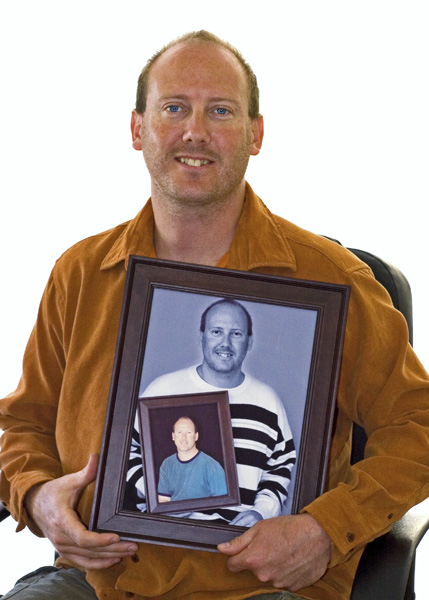
You know, I'm having a bit of trouble deciding why this was a 5.1. I think it's a decent shot. I gave it a 6. Perhaps two things jump out at me.
1) DPC does love a white background, but this is, if possible, too white. It almost overwhelms you. I don't think gray would have been better, but instead of having a 0.0.0 white, maybe a 15,15,15 white or something would have been better. I'm not sure.
2) The pose is a bit static. I think it's a neat idea pulled off well. Sure, it's been done before, but not enough that it has become cliche. I'm not a portrait artist, so I don't have a lot to help you with the pose, but I wonder if that was part of the problem.
3) I'm really puzzled by the 60 scores of 4. I really don't know. Sometimes you win, I guess and sometimes you lose. Keep it up though. |
|
 Photographer found comment helpful. Photographer found comment helpful. |
Comments Made During the Challenge  |
|
|
04/21/2006 08:58:48 PM |
| Inventive. The white bg is a tad bright, an out of focus backdrop (like brick or desk setting) may have complimented this portrait. |
|
| Photographer found comment helpful. |
|
|
04/21/2006 06:26:48 AM |
| Great idea; You know it might work well with photos from different ages as well. |
|
| Photographer found comment helpful. |
|
|
04/19/2006 02:46:28 AM |
| I like the concept. Well done. |
|
| Photographer found comment helpful. |
|
|
04/19/2006 01:34:50 AM |
haha this is a great idea for a portrait
I would love to see you standing instead of sitting though |
|
| Photographer found comment helpful. |
|
|
04/18/2006 03:51:46 AM |
|
| Photographer found comment helpful. |
|
|
04/18/2006 03:01:37 AM |
| Not raelly fond of the composition here, you cut off parts of both his hands but just barely, I think it´s ok to do that when you really take big parts off but this just looks accidental or that you didn´t have enough space to back off from him (yourself) Also the lighting isn´t really doing anything from me, I would suggest some way to light his face more and with softer lighting, doesn´t have to be complicated, just bounce a flash on a diffusing reflector a little bit from above. |
|
| Photographer found comment helpful. |
|
|
04/17/2006 02:47:34 AM |
| Clever idea...just a little soft in the focus. great title |
|
| Photographer found comment helpful. |
|
|
04/17/2006 01:59:10 AM |
|
| Photographer found comment helpful. |
|
|
04/16/2006 11:10:54 PM |
| Nice concept. - 7 from me |
|
| Photographer found comment helpful. |
Home -
Challenges -
Community -
League -
Photos -
Cameras -
Lenses -
Learn -
Help -
Terms of Use -
Privacy -
Top ^
DPChallenge, and website content and design, Copyright © 2001-2025 Challenging Technologies, LLC.
All digital photo copyrights belong to the photographers and may not be used without permission.
Current Server Time: 04/08/2025 01:56:02 AM EDT.