| Author | Thread |
Comments Made During the Challenge  |
|
|
04/23/2006 06:36:05 AM |
Very nice but a tad bit small for this forum. If you need help with resizing for DPC, please feel free to pm me after voting is done!
TC |
|
 Photographer found comment helpful. Photographer found comment helpful. |
|
|
04/22/2006 06:45:14 AM |
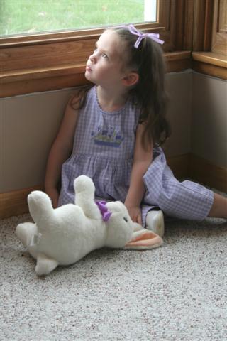
| Nice use of natural light... However, I think there's to much rug in the foreground. A tighter crop would do wonders for this image. |
|
| Photographer found comment helpful. |
|
|
04/20/2006 06:35:47 PM |
| I'm not going to say this wasn't a studio picture, I'm almost certain somebody else has already said something, but I think I don't like it because the wood is distracting, the animal too. |
|
| Photographer found comment helpful. |
|
|
04/20/2006 03:06:31 PM |
| a nice image, but the focus is poor. this is too bad, as the colours are quite nice. a close crop with less floor would have helped too. |
|
| Photographer found comment helpful. |
|
|
04/19/2006 03:01:26 AM |
| Nice image but a bit soft IMHO. I would have liked to see the subject in better focus. |
|
| Photographer found comment helpful. |
|
|
04/19/2006 01:56:52 AM |
| why is this image so small ? |
|
| Photographer found comment helpful. |
|
|
04/18/2006 06:21:09 PM |
| Why not save your shots in the biggest format allowed.....ie 640 pixels, and maybe soon 720, if they make the change on DPC? If you have photoshop, and dont know how to do this, I'd be happy to help. I dont mean to impose, but I do think that the larger format would have more impact, and strengthen your entry. |
|
| Photographer found comment helpful. |
|
|
04/18/2006 03:42:39 AM |
| Why only 480 pixles on the long dimension? Your score would go up heaps if you made full use of the max size here, trust me. |
|
| Photographer found comment helpful. |
|
|
04/17/2006 07:39:05 AM |
| By biggest suggestion would have been to really zoom in close on her face, with the light. The dead space of the floor and placement makes this one feel a bit odd. The lighting on her face from the window is very natural though. Also, the focus is quite blurry. Some unsharp mask would have helped! nice attempt though. -3 |
|
| Photographer found comment helpful. |
|
|
04/17/2006 05:20:36 AM |
| Too much empty space on the bottom. A littl fill light to brigten up under the window would have helped a bit too. |
|
| Photographer found comment helpful. |
|
|
04/17/2006 02:04:26 AM |
| she's so far away its hard to really see her. I think you might get other comments too that suggest cropping it much tighter losing the floor and just concentrating on her and the rabbit because the light on her face abnd the pose are very very strong |
|
| Photographer found comment helpful. |
|
|
04/16/2006 10:25:24 PM |
Nice photo. I like the natural lighting, the use of the stuffed bunny and she's really cute.
What I would do to improve this is to change the background and composition.
First the background, it's just not interesting. For this challenge it needs to look more studio-like. I do like the window/natural lighting so I would perhaps have her sitting in a chair and zoom in on her so that the corner isn't in the shot nor is the carpet.
Second in regards to the composition, I'd try a different way of cropping this. If you wanted to keep the full body shot then I'd suggest shooting it landscape style (not in that corner) that way you don't cut off her foot and you could add some impact if you have her off-centered. If you stick with the portrait style then I would zoom in on just her head and shoulders which would fix the issue with the corner background/carpet.
Well those are my thoughts. I'm no expert so take with a grain of salt. :) Good luck! |
|
| Photographer found comment helpful. |
Home -
Challenges -
Community -
League -
Photos -
Cameras -
Lenses -
Learn -
Help -
Terms of Use -
Privacy -
Top ^
DPChallenge, and website content and design, Copyright © 2001-2025 Challenging Technologies, LLC.
All digital photo copyrights belong to the photographers and may not be used without permission.
Current Server Time: 04/07/2025 01:15:51 PM EDT.