| Author | Thread |
Comments Made During the Challenge  |
|
|
08/12/2003 07:14:32 PM |
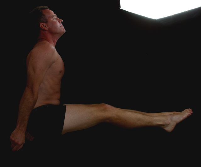
| The bright area in the top right corner detracts attention from the 90 degree angle of the subject. Still, I scored this fairly high for its adherence to the directions while giving an organic feel - 7 |
|
|
|
08/12/2003 11:29:17 AM |
| very original (and painful looking too!). It almost looks if he's floating there! |
|
|
|
08/11/2003 09:47:56 PM |
| Very nice, and very hard to hold! I think the lighting on the subject could have been brighter, I can barely see him. I like this one. |
|
|
|
08/11/2003 01:10:06 AM |
| Interesting compostion. Needs more contrast. Don't like the bright light in the picture. |
|
|
|
08/10/2003 01:30:47 PM |
the subject is too dark and the white at the top right distracts significantly.
excellent idea, though. |
|
|
|
08/09/2003 01:26:00 AM |
| Very creative. Effective angle, but I would suggest to ad more light. |
|
|
|
08/08/2003 07:58:17 PM |
| Better lighting will make this a great photo |
|
|
|
08/07/2003 11:29:09 AM |
| Well composed, fits the challenge nicely. Maybe could have done something different with the lighting for a more powerfull photo. |
|
|
|
08/07/2003 02:46:37 AM |
| a nice photo tho the upper right corner spoils it. |
|
|
|
08/06/2003 09:33:35 PM |
| nice idea. wish the light was not in the frame though. it takes the attention away from the subject. |
|
|
|
08/06/2003 07:43:31 PM |
| The bright light in the upper right is distracting. Strong guy! |
|
|
|
08/06/2003 07:19:08 PM |
| I don't like the white patch at the top of the pic... it seems out of place. Plus the lighting on the person isn't to good. Creative however and does fit the challenge. |
|
|
|
08/06/2003 06:42:16 PM |
| what is the strange white box in the corner? i would have like this photo much better without it |
|
|
|
08/06/2003 04:13:45 PM |
| Wow, the right angle really shows here. Light in top right a bit distracting. Nice photo. |
|
|
|
08/06/2003 03:10:33 PM |
| The only thing that bothers me about this picture is the light at the top. It draws my attention to it instead of the right angle with the man. Great work though. Wish I could hold a pose like that! |
|
|
|
08/06/2003 02:20:28 PM |
| excellent idea, just too dark.... |
|
|
|
08/06/2003 01:09:31 PM |
| I found the white in the upper right distracting |
|
|
|
08/05/2003 10:14:38 PM |
| this would be have been a great image in brighter light too |
|
|
|
08/05/2003 09:57:40 PM |
Composition = 9
Challenge = 10
Technical = 6
would have liked it better without the bright light in the upper right hand corner
Creativity = 8
X2 Wow factor = 8
49/6=8.16
congrats
|
|
Home -
Challenges -
Community -
League -
Photos -
Cameras -
Lenses -
Learn -
Help -
Terms of Use -
Privacy -
Top ^
DPChallenge, and website content and design, Copyright © 2001-2025 Challenging Technologies, LLC.
All digital photo copyrights belong to the photographers and may not be used without permission.
Current Server Time: 04/07/2025 12:59:21 PM EDT.